Consulting & Brand Repositioning
UX Consulting for Play Acclaim
UX Consulting · Digital Repositioning for an Iconic Brand · playacclaim.com
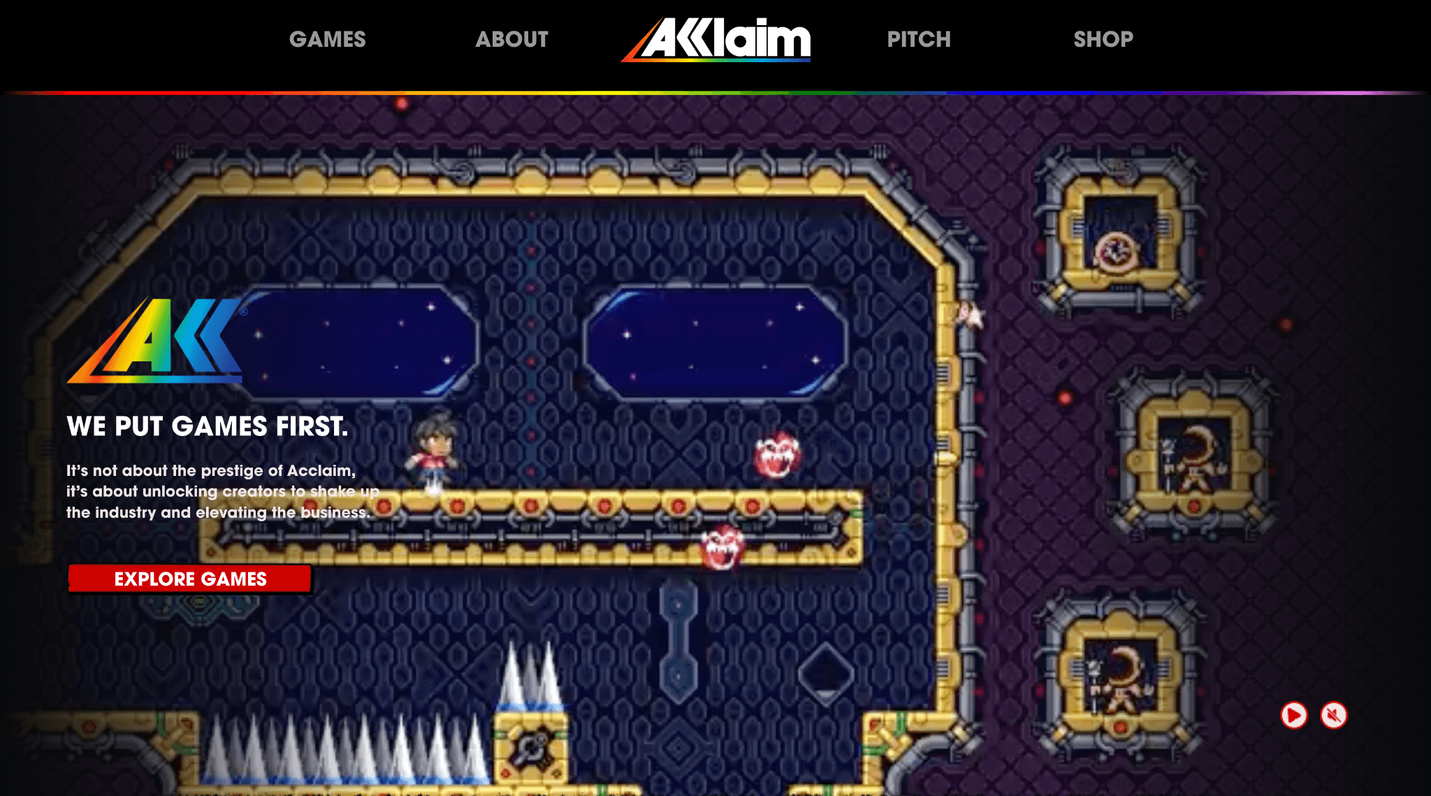
A Brief History
Acclaim was one of the most recognizable names in gaming. Founded in 1987, it grew into a powerhouse publisher responsible for Mortal Kombat, Turok, NBA Jam, and dozens of other beloved titles, and defined an era of gaming.
More than two decades later, a team of industry veterans came together to bring it back. The new Acclaim, operating as Play Acclaim, relaunched in early 2025 with a clear mission: honor legacy, support indie game developers, and deliver to a global audience.
The Engagement
Shortly after Play Acclaim's Showcase in September 2025, I was brought in as a UX consultant to work alongside Acclaim's internal team of designers and developers during the repositioning of their new website. My role was not to redesign the website, but to audit, direct, and document. The design team had built a substantial Figma file and component library. My job was to evaluate it critically, identify where UX was working against the business goals, and leave behind a clear set of decisions and a prioritized implementation roadmap the team could act on before development.
The four business goals the website needed to serve, in order of priority:
- Steam wishlists: drive game discovery and wishlist adds for titles in the Acclaim publishing pipeline
- E-commerce conversions: convert brand-loyal visitors into buyers
- Game showcases: give players a deep, immersive look at individual titles
- Social following and brand visibility: extend Acclaim's refreshed presence and grow an engaged community on existing channels
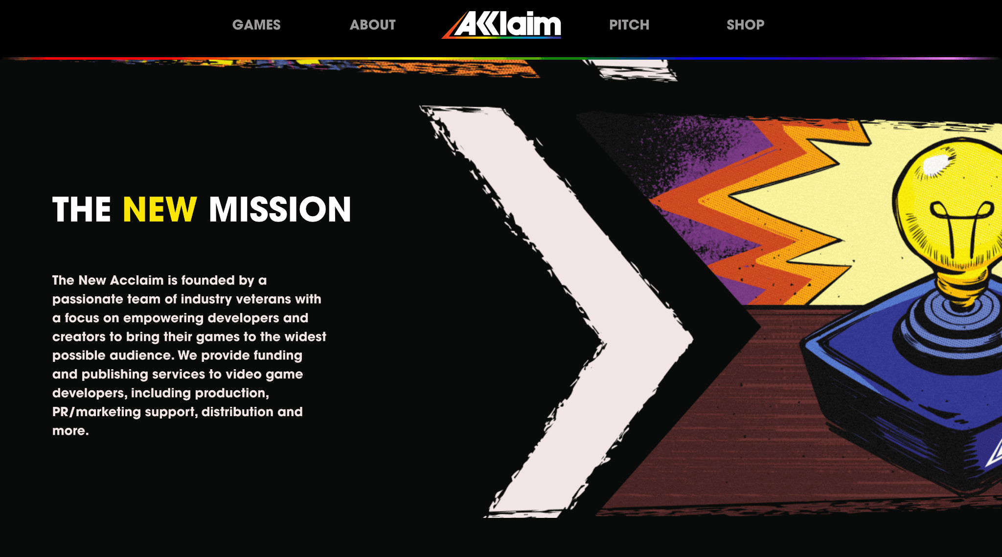
What the Audit Found
Three interconnected problems surfaced across the Figma file:
1. Content hierarchy and CTAs were buried
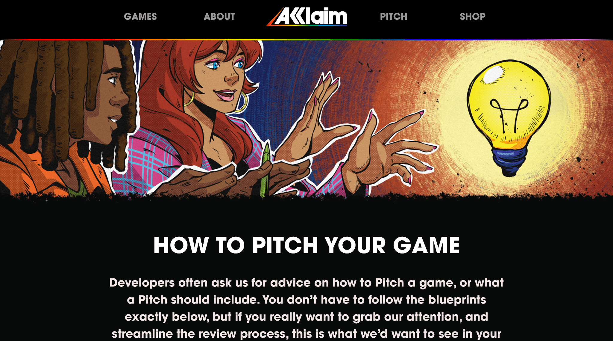
The primary conversion actions, Steam wishlist buttons and merch purchase CTAs, were not positioned to intercept users at the moments of highest intent. In several key screens, headline CTAs competed visually with secondary content, creating ambiguity about what the page was asking users to do. The hierarchy treated everything as equally important, which effectively conveyed nothing.
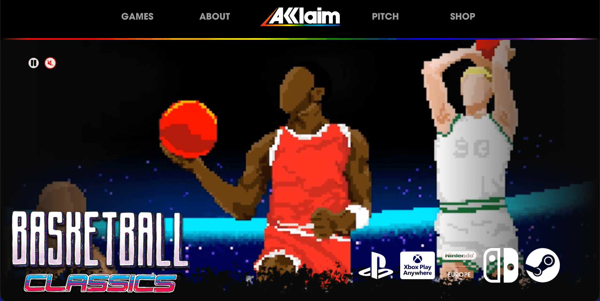
On game detail pages specifically, the wishlist CTA, the page's most critical conversion action, was not occupying the visual position or treatment it warranted. Users landing from search or social with direct intent to wishlist a game had to work to find the action.
2. Desktop designs weren't translating to responsive breakpoints
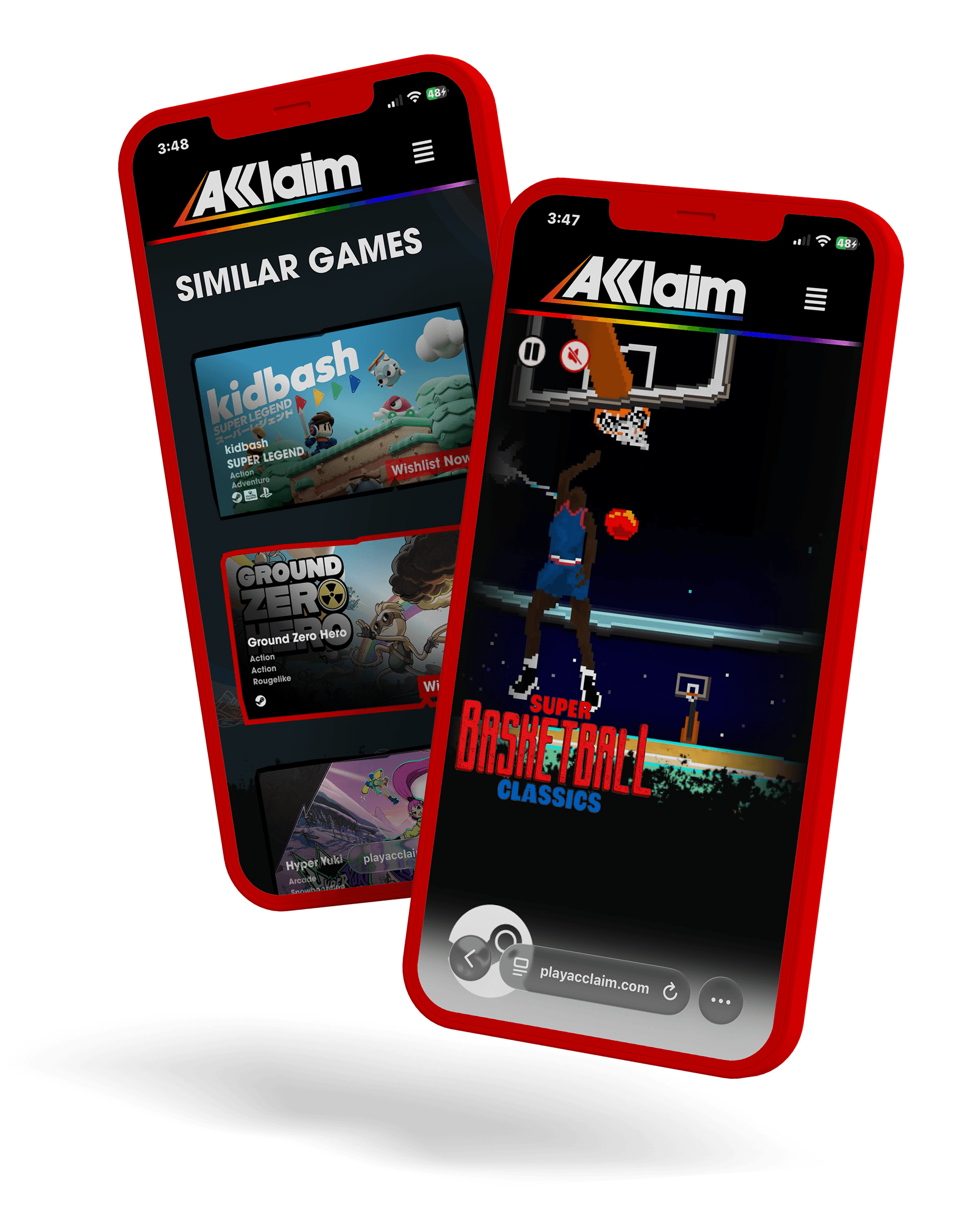
The Figma file was predominantly designed at desktop scale. At mobile and tablet breakpoints, content blocks were compressing in ways that broke visual rhythm, cut off creative elements, buried navigation, and, in some cases, stacked CTAs in an order that reversed the intended conversion priority. For a US-facing audience where mobile traffic is dominant, this was a critical gap.
Content meant to build emotional resonance, like game imagery, brand story moments, and legacy references, collapsed at smaller sizes, removing the context that made the CTA meaningful.
3. Legacy Disconnection
New audience positioning
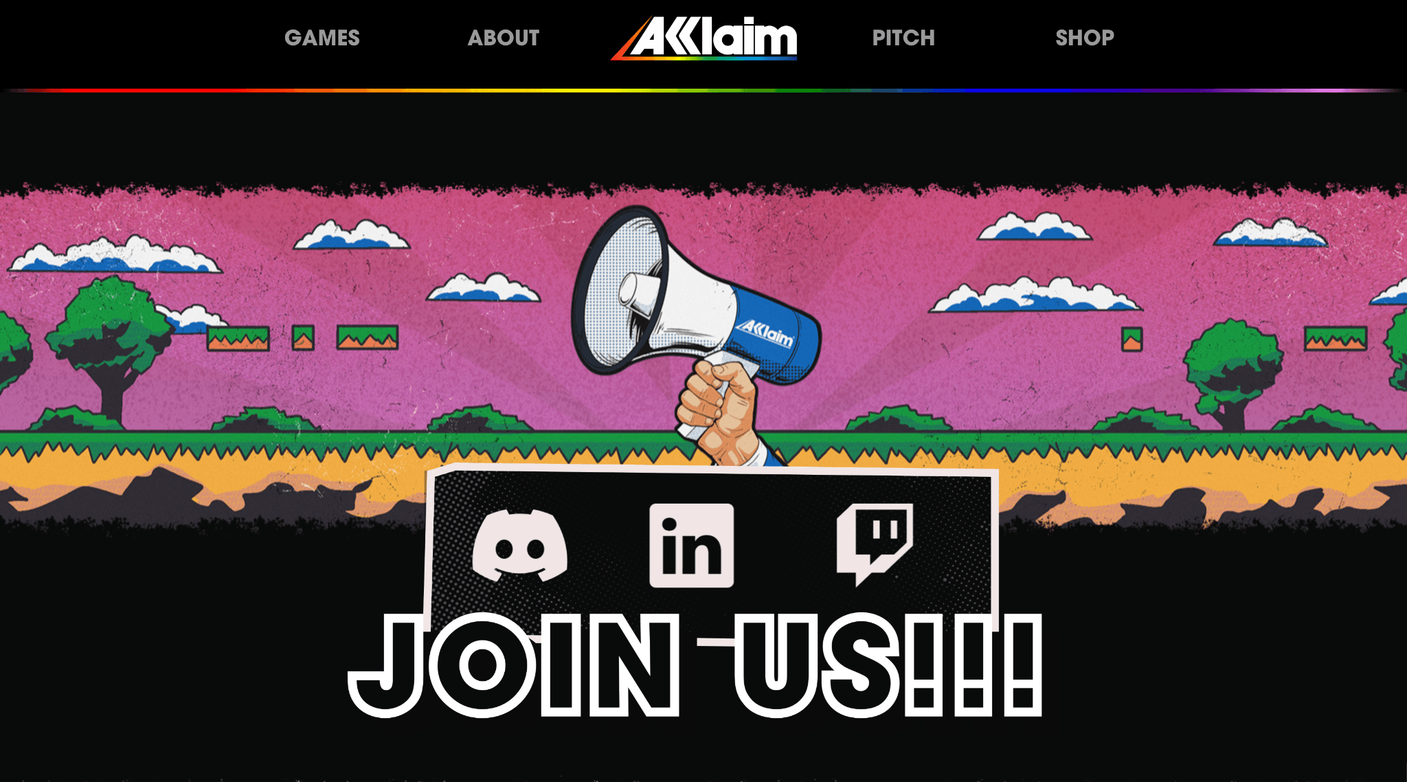
Acclaim's legacy branding wasn't connecting with new audience members. Stakeholders came to the table with feedback of channel underperformance, and a need to connect to audiences through nostalgia while retaining younger demographic attention.
In several sections of the wireframe, these two were side by side without a clear visual or narrative bridge between them. The tone was inconsistent; some sections felt like a museum exhibit, others like a generic indie publisher. Neither fully served the repositioned Acclaim identity: a gritty, creative, developer-first studio that honors its past while actively shaping what's next.
My Recommendations
Content and CTA repositioning
I audited and re-prioritized the content hierarchy across the homepage, game pages, and merch sections by annotating directly in Figma with specific recommendations for CTA placement, visual weight adjustments, and copy changes. Steam wishlist buttons were elevated to primary visual prominence on game pages, and I worked with designers to create the visual design and movement that fit Acclaim's branding. Secondary conversion actions (social follow, newsletter) were repositioned lower in the page flow, behind the primary ask, and actively synced and updated with recent posts.
Responsive design direction
I documented specific breakpoint recommendations for mobile and tablet, flagging which content blocks needed redesign rather than simple compression. Specific attention was paid to the game detail page on mobile to ensure the hero imagery, game title, and wishlist CTA remained intact across all screen sizes. Navigation recommendations addressed the collapse behavior at these smaller viewports.
Brand voice and visual hierarchy
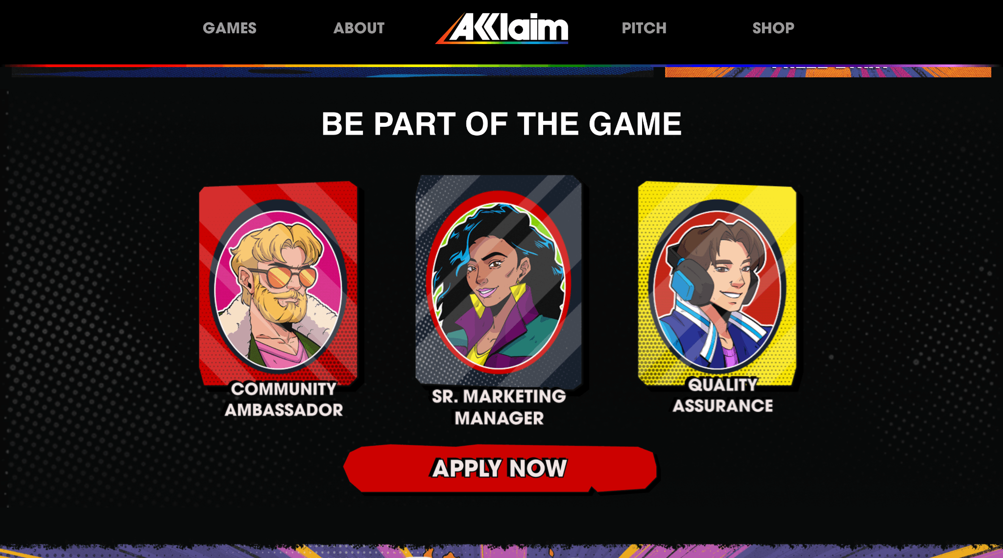
I provided direction on how to establish a bridge between the legacy and the refreshed branding, using visual and section hierarchy to lead with the new Acclaim's mission and voice, then earn the nostalgia references rather than leading with them.
Deliverables
Reflection
Consulting on a brand with a vast nostalgic digital footprint was different from the usual ‘building something new’. Every recommendation I gave had to be grounded in the business goal first (What's this page trying to do/communicate? Is the design helping or hindering that?) while remaining sensitive to the dedicated work the internal team had already invested in.
The internal design and development teams knew what they were building, and I assisted in bringing both teams and stakeholders together in a design they could understand, defend, and, most importantly, be excited about. As an outsider, it was easier to walk the user's path without attachment to any particular decision, and to document a direction they could implement without me in the room.
What I'd do differently: Push earlier for a defined mobile-first constraint at the start of the audit. Most of the responsive issues I found were consequences of designing desktop-first. Establishing that framing upfront would have focused the audit more efficiently.
Related Work
UI Design & Handoff
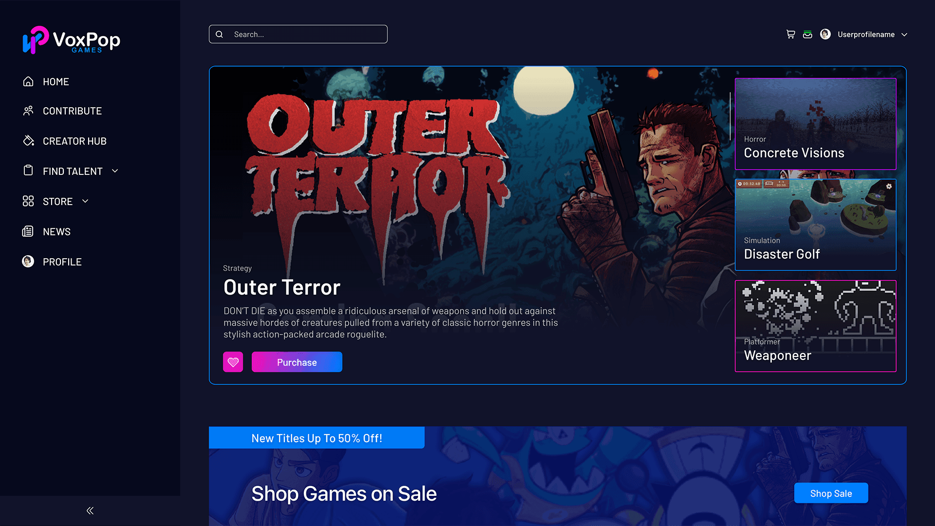
UI for Indie Game Marketplace & Creator Platform
Strategy and design for publisher VoxPop Games for an innovative platform that's part indie game marketplace, part hiring pipeline, part profit-sharing, and part social hub.
Website Redesign & Prototyping
High-Fidelity Prototyping for Immigration Platform
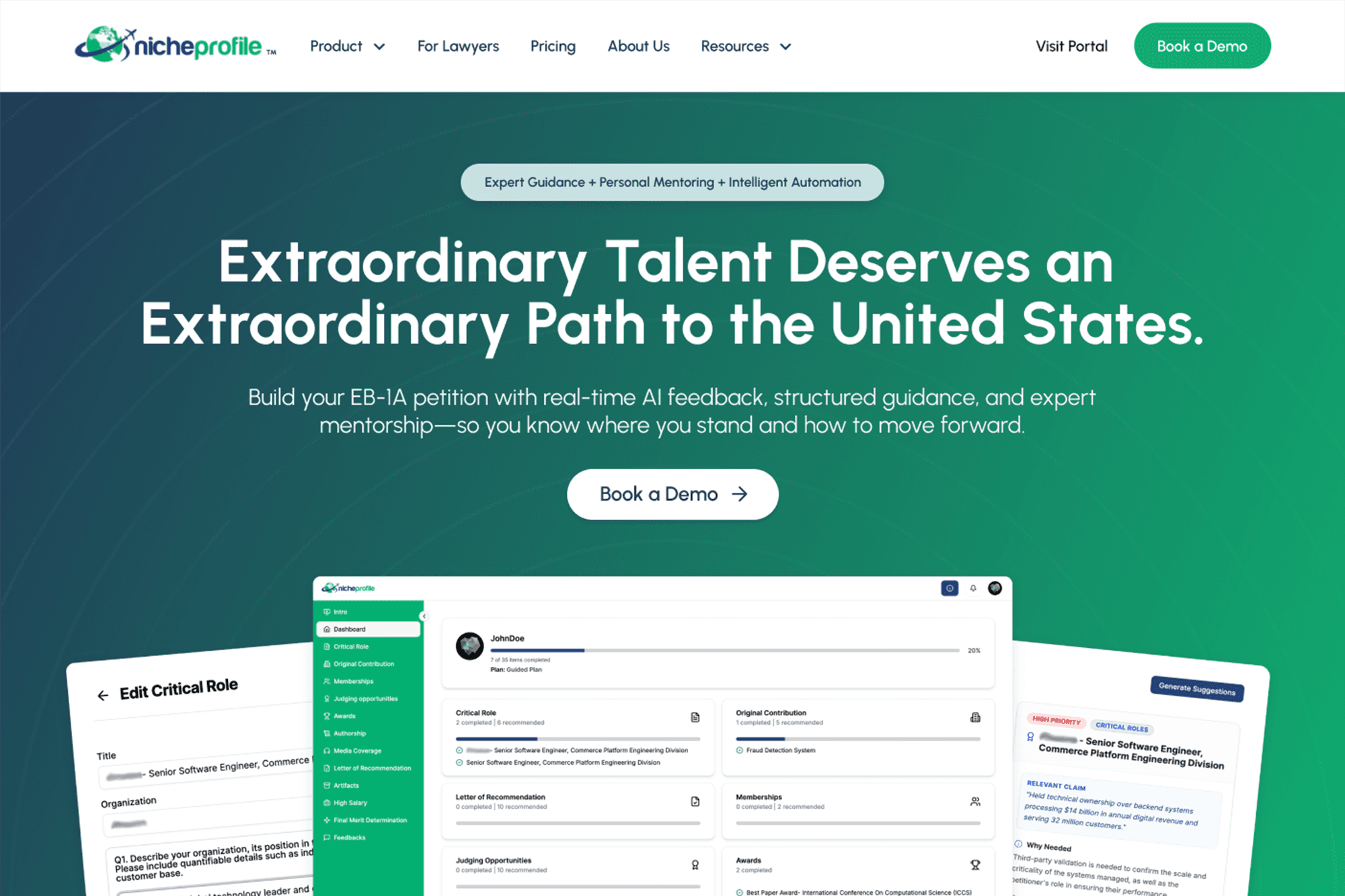
Full website redesign and developer handoff for an EB-1A immigration advisory platform, NicheProfile, including a three-tier e-commerce flow, portal onboarding graphics, and component library.