UI Design & Handoff
UI for Indie Game Marketplace & Creator Platform
VoxPop Games, Inc.
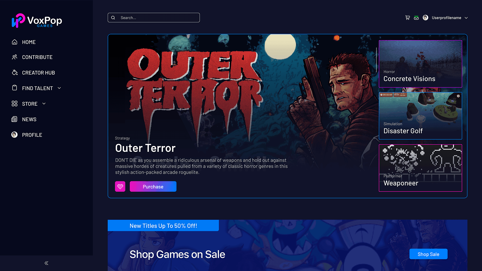
The Platform
VoxPop Games was building something without a clear reference point: a web application that was simultaneously a Steam-like indie game store, a hiring marketplace for game developers and creatives, an equity investment platform for indie studios, and a community hub for college-aged students aspiring to break into the gaming industry.
The core model was built around profit-sharing. Indie developers could list their games, recruit contributors (artists, programmers, audio designers, 3D modelers, etc.), and offer equity stakes in their projects, meaning contributors got paid when the games launched and sold. Investors and shareholders could discover games in development and back them through the platform. Gamers could purchase titles, wishlist upcoming releases, and follow the studios and creatives behind them. Think Steam meets LinkedIn meets Behance.
VoxPop had branding but lacked a UI kit for applications. Building a cohesive visual language across 115 screens, from storefront to payout dashboard to hiring pipeline to student portal, with no existing component system and no design system in scope, was the defining constraint of the project.
The Challenge
Four distinct user types under one platform, each with unique goals, funnels, and success states:
Indie developers & studios needed a professional home base, a profile that functioned as both a portfolio and a hiring pipeline, with tools to post jobs, review applicants, manage team members, and track equity distribution.
Contributors (artists, programmers, designers) needed a job board filtered by their discipline and experience level, a clear understanding of what the equity payout looked like, and a frictionless path from application to a signed contract.
Gamers needed a familiar store experience, browse, wishlist, purchase, and game library, with enough distinctiveness to feel like a destination, not a pale imitation of industry leader Steam.
College students needed a separate entry point, a Student Hub that positioned VoxPop as a professional development pathway.
None of these audiences could be treated as secondary. A developer browsing the platform would also see the store. A gamer might discover the contributor flow. A student could become a contributor.
The IA and navigation had to hold all four contexts without fracturing the experience, as all four audiences have access to the same fully fleshed-out portal experience and often overlap.
Process
1. Establishing Visual Patterns
Without a UI kit in scope, I established consistency through disciplined repetition of a small set of design foundations: the dark navy background, the gradient magenta-to-blue accent system, card component structures, and typographic hierarchy. Every new screen expanded from these foundations, rather than inventing new ones as we designed and developed in tandem.
This wasn't a formal design system, but it served as one in practice, because every component I handed off to developers was annotated with spacing, color values, font sizes, and interaction notes directly in Adobe XD.
2. Building a Storefront for Indie Gaming
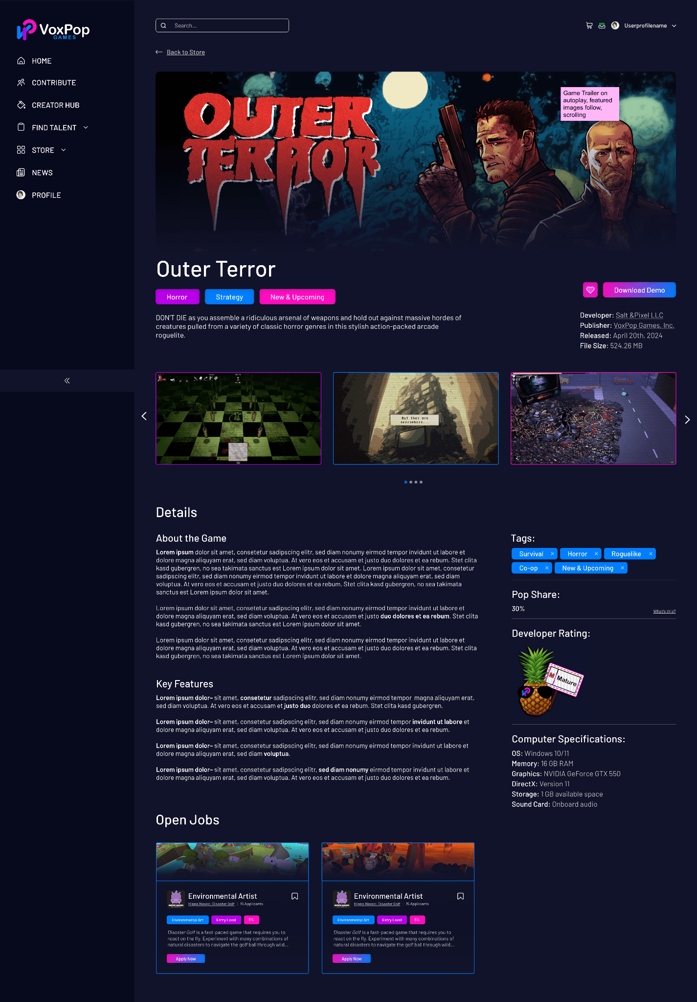
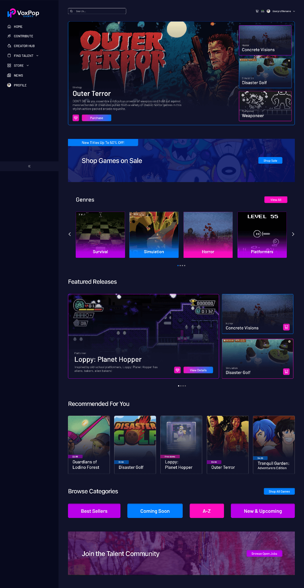
The store was the platform's first priority and the experience that most users would encounter first. The design challenge was clear: Steam has 25 years of learned user behavior behind it. Users arrive at any game store with strong expectations about how discovery, browsing, purchasing, and library management should work. Meeting those expectations while giving VoxPop a distinct visual identity and layering in the platform's unique equity and contribution angles required UX research and feedback sessions.
Key store design decisions:
- Hero carousel leading with featured in-production releases, anchored by strong game creative and immediate purchase and wishlist CTAs.
- Genre category cards using real-time game screenshots rather than icons, putting the games' visual identities front and center
- "Recommended for You" section establishes personalization from the first session
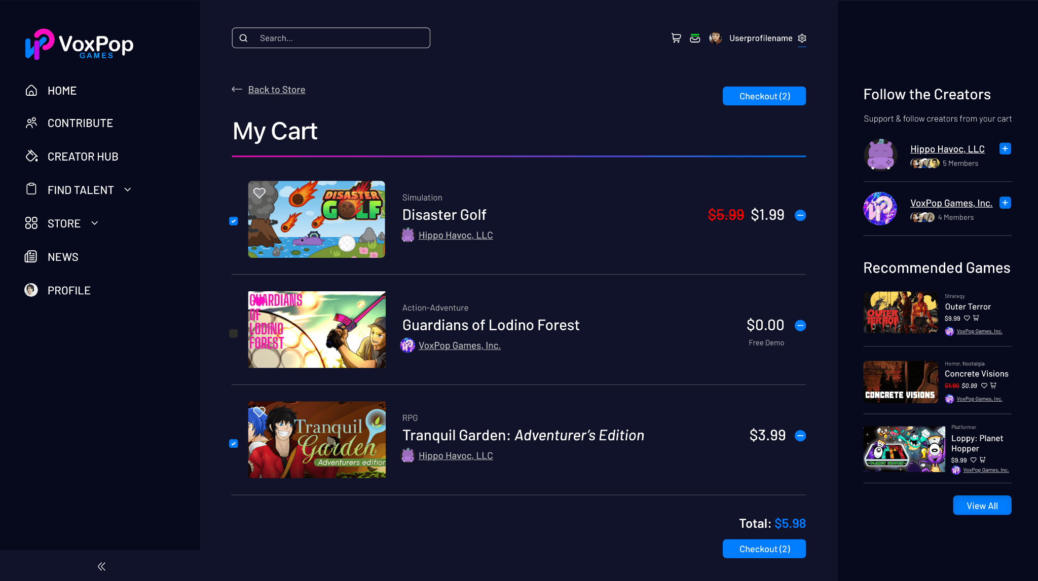
- Cart page designed with a "Follow the Creators" sidebar surfacing the studio, developers, creatives, and students behind each purchase and reinforcing VoxPop's community identity
- Coming soon/wishlist system giving users a stake in games still in development, with wishlist CTAs that signal support to developers and notify users at launch
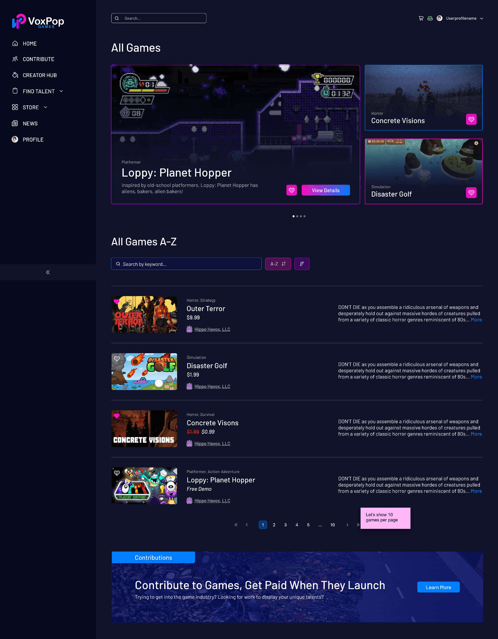
- Store Category pages with inline filtering, sortable list/grid toggle, and pagination, designed to handle a growing catalog without requiring redesign
3. The Contributor Flow
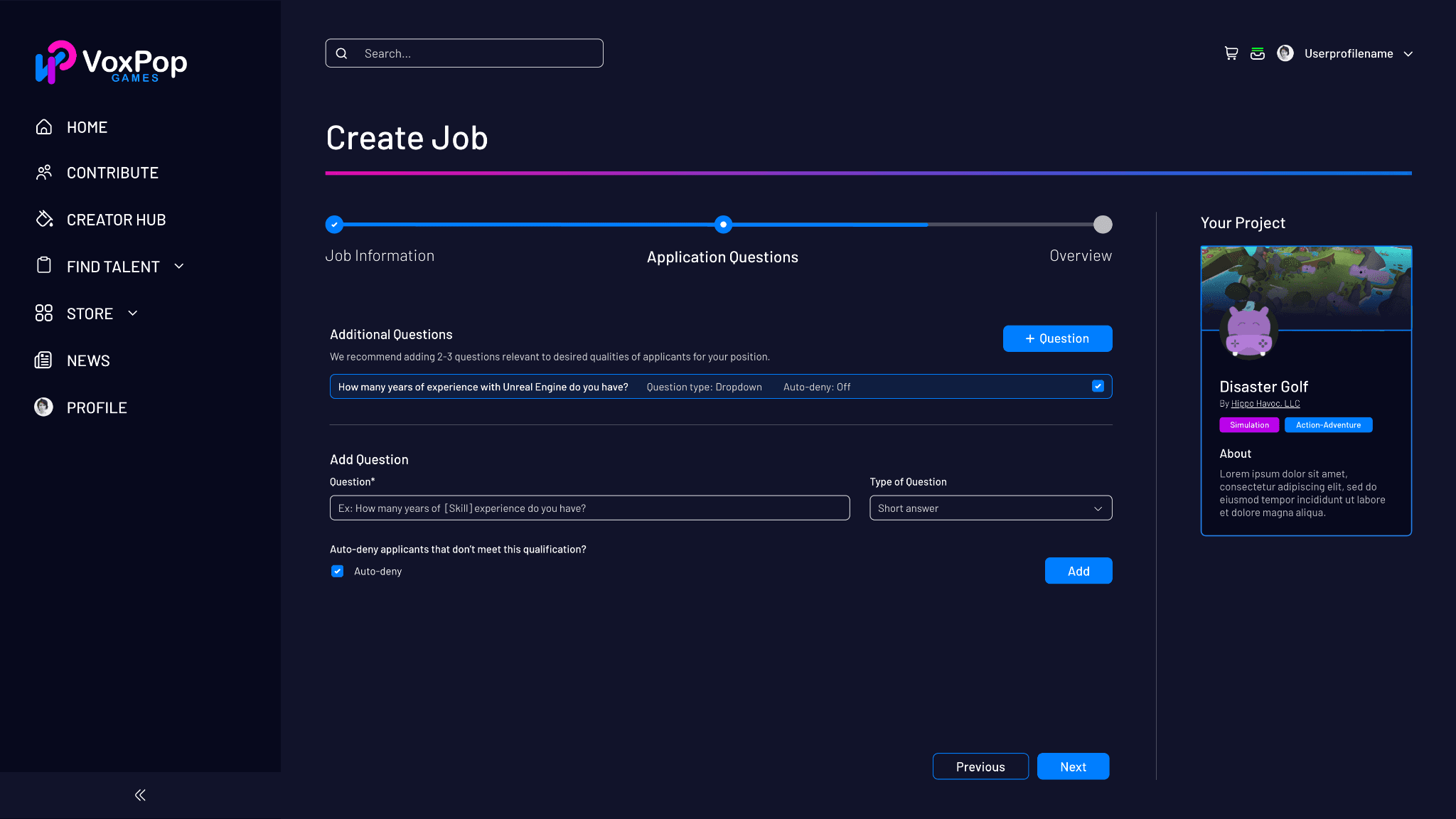
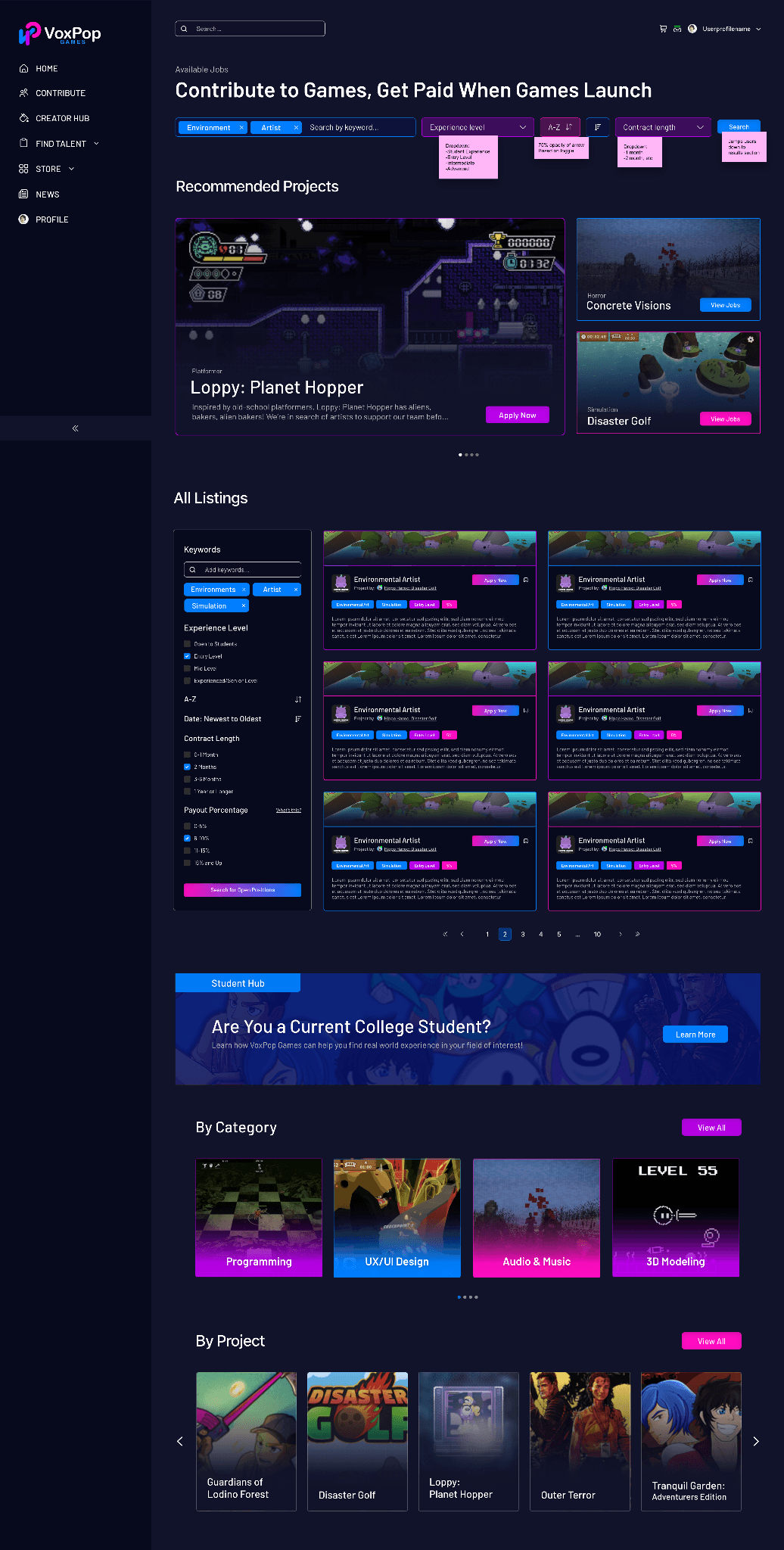
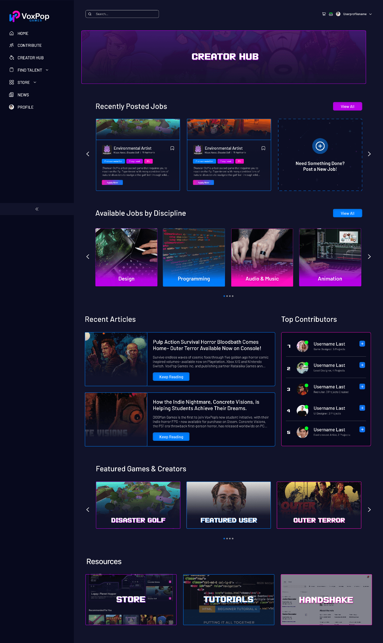
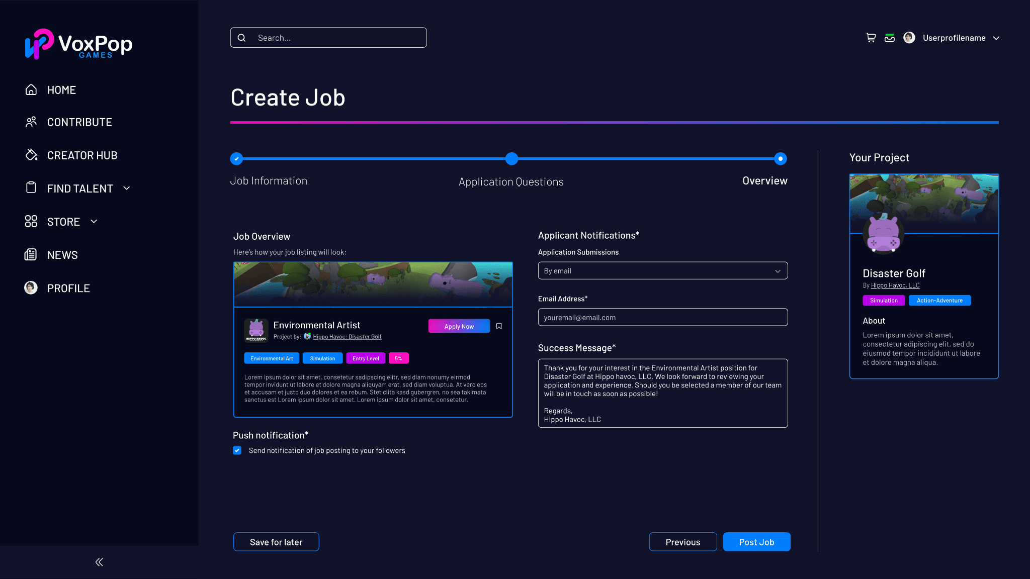
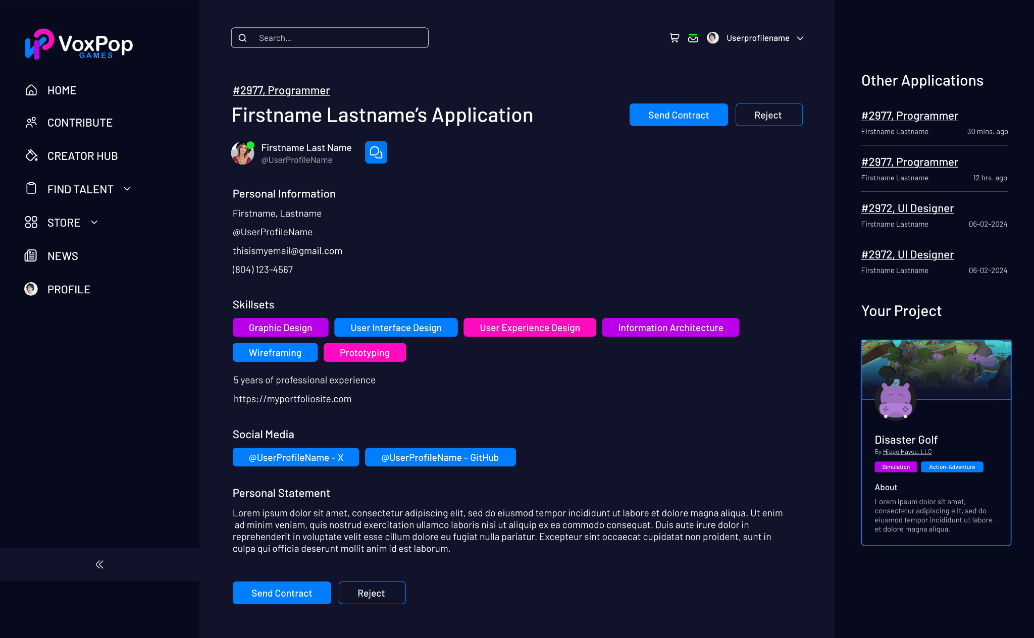
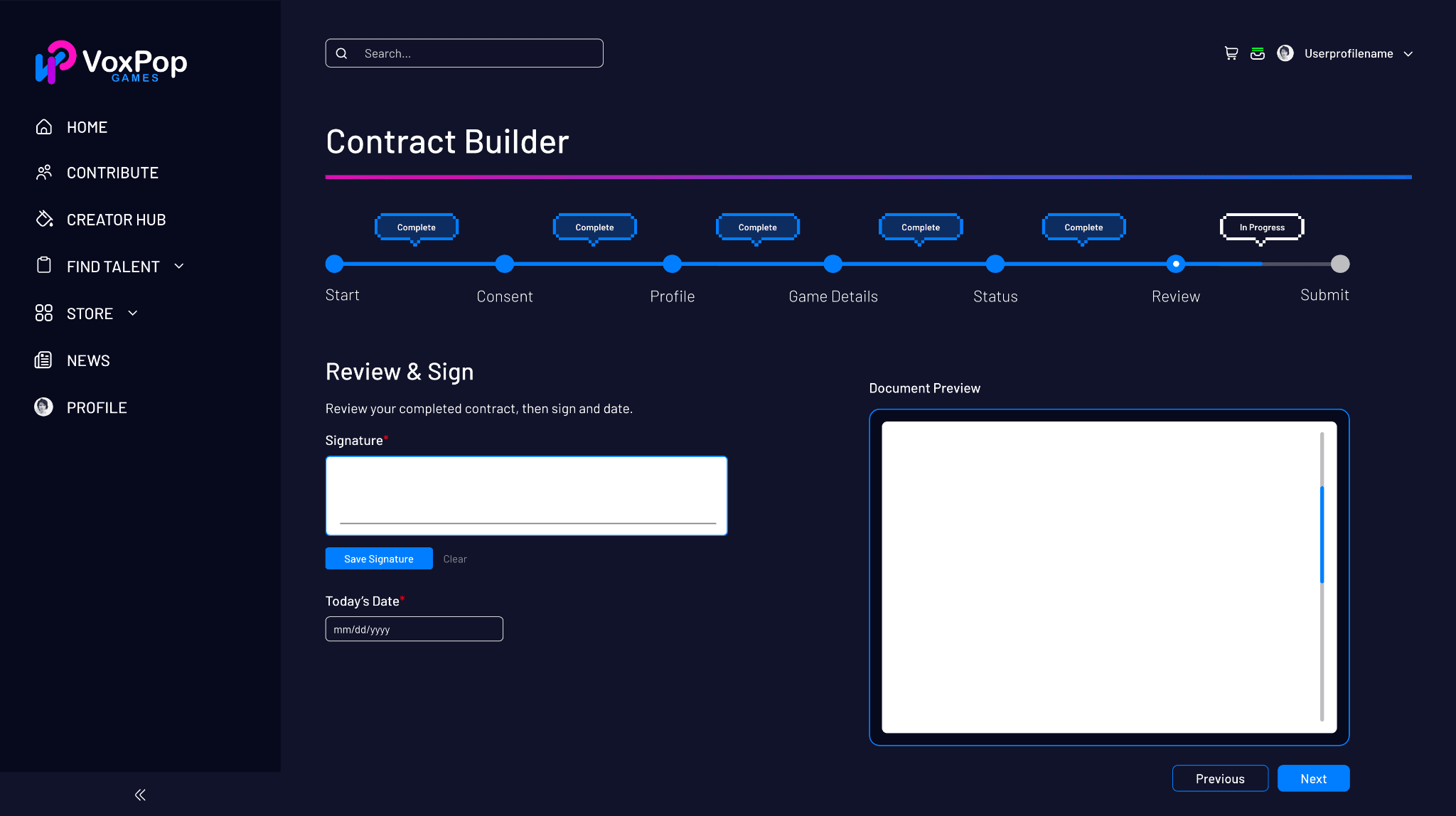
The hiring pipeline, from job listing to contract drafting, was the platform's most complex UX surface. Contributors needed to filter available jobs not just by role (Design, Programming, Audio, Animation) but by experience level, contract length, and payout percentage, unique to an equity-share marketplace.
I designed:
- Contribute landing page with recommended project cards, discipline category browsing, and a Student Hub entry point
- All listings view with a persistent left-side filter panel (keywords, experience level, sort order, contract length, payout %) and a paginated job card grid
- Job cards surfacing the essential decision-making information, role, project, tags, experience level, equity %, without requiring a drill-down to evaluate fit
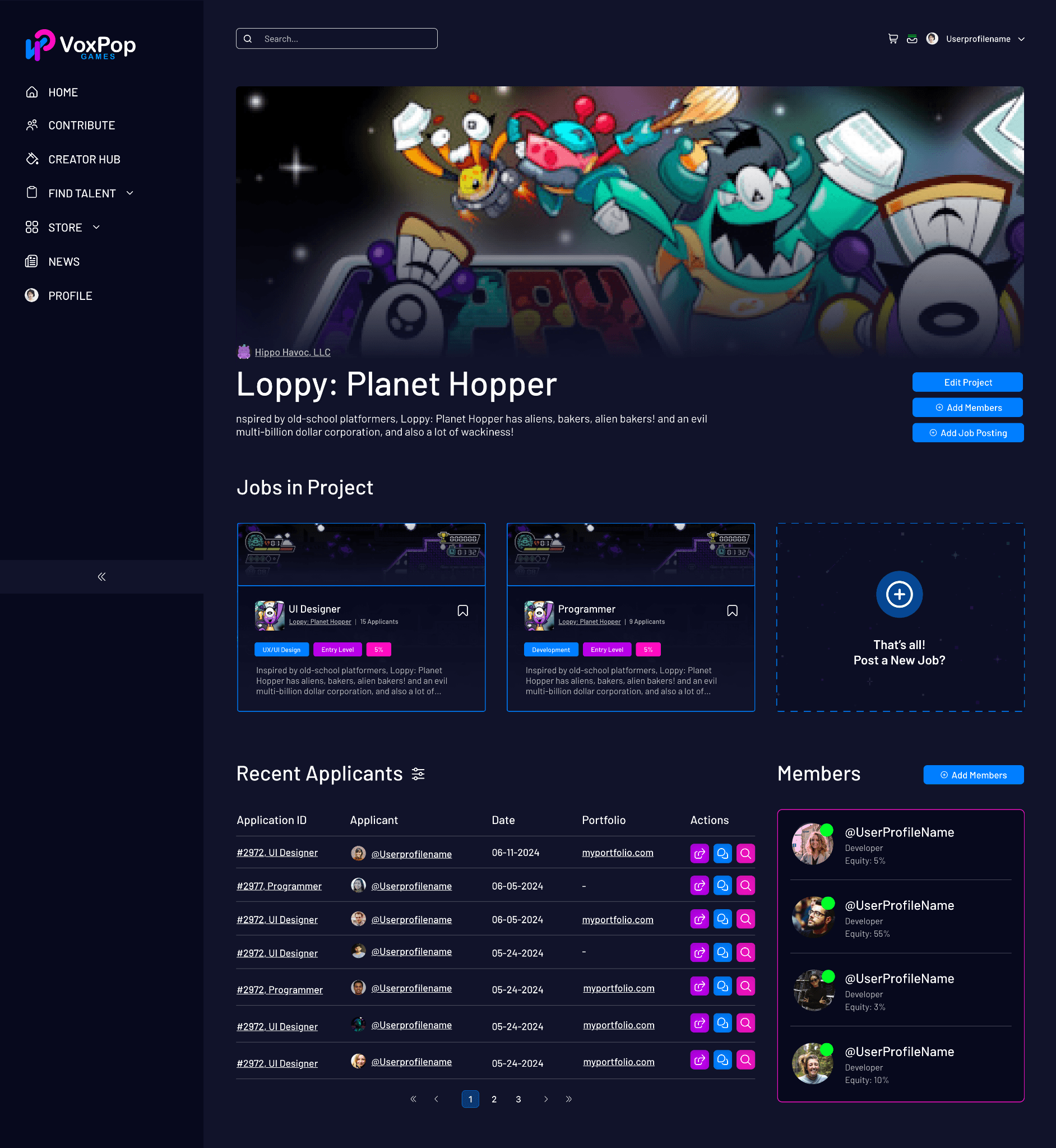
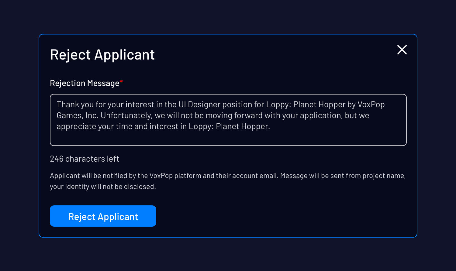
- Project management page for studio-side users: active job postings, recent applicants table with portfolio links and action controls, team member roster with individual equity percentages displayed
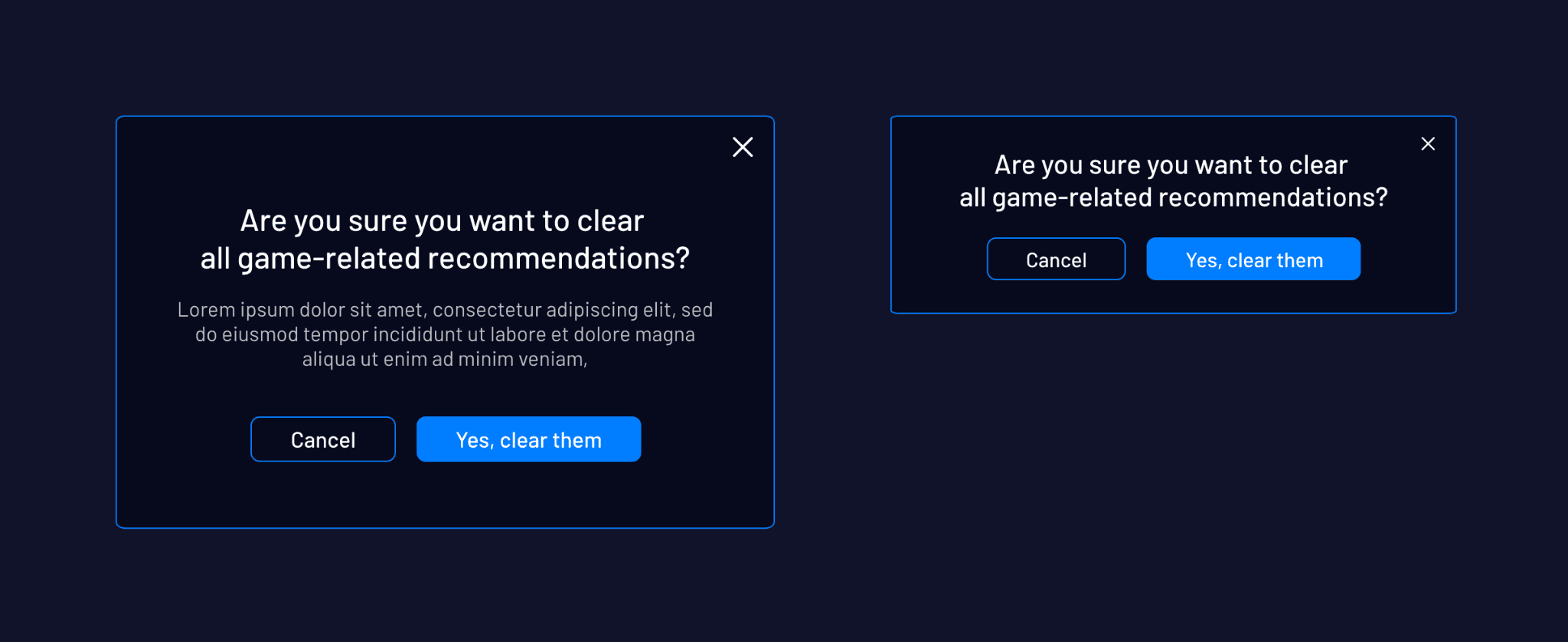
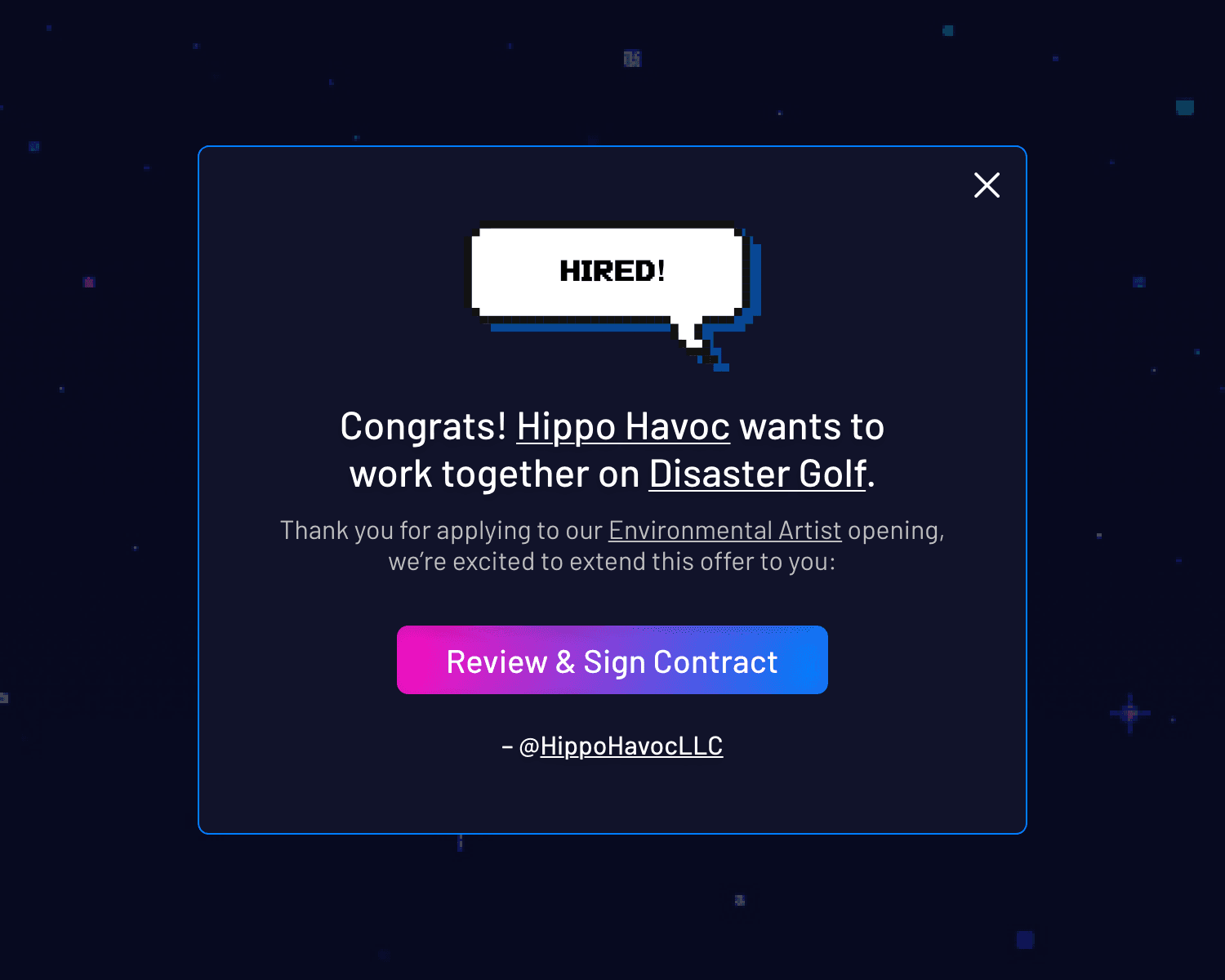
The flow finishes with a playful “You're Hired!” modal, a pixel-art-style confirmation screen that matches the gaming platform's ‘vapor-wave’ visual identity while delivering the celebratory moment. The CTA routed directly to contract review and signing, collapsing what could have been a multi-email back-and-forth into a single in-platform action.
4. User Profiles
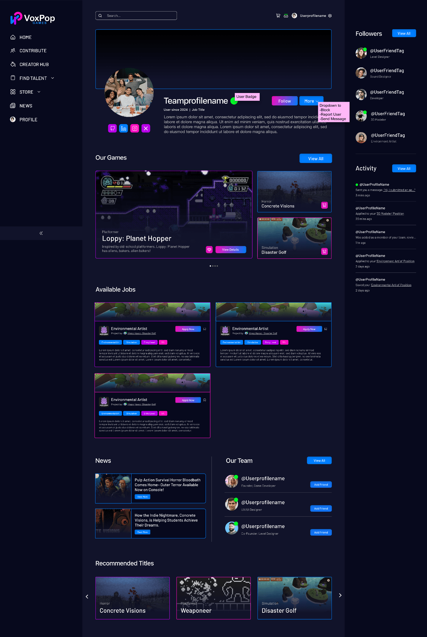
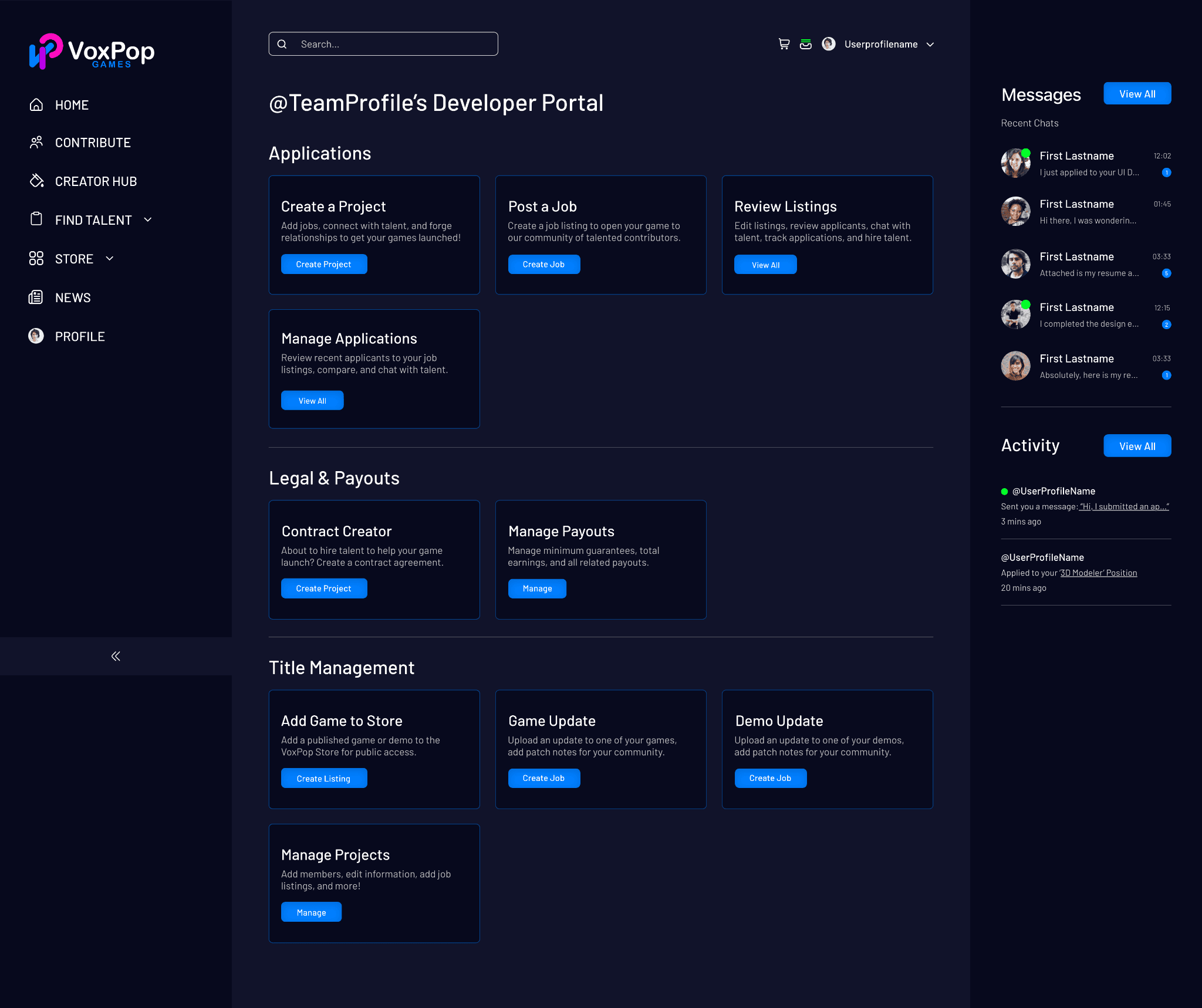
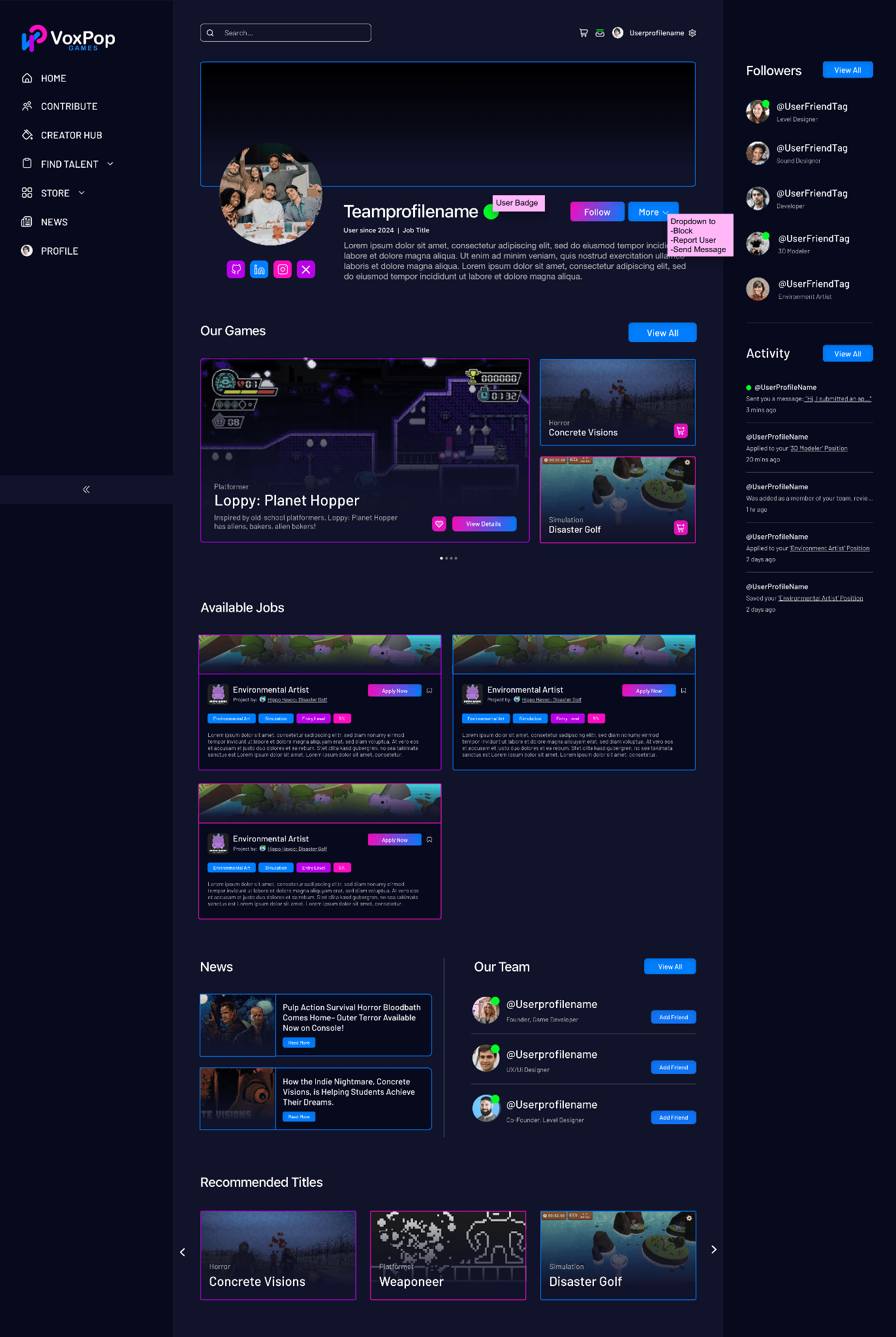
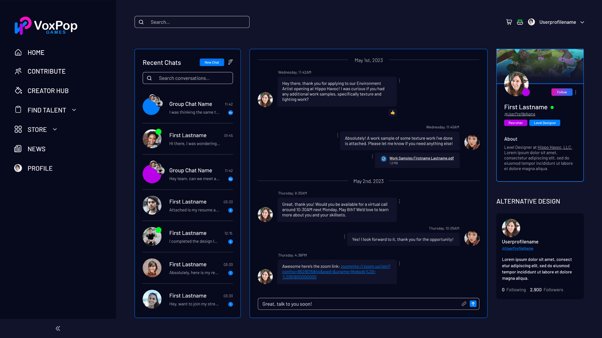
Profile pages had to serve as tri-purpose identity pages simultaneously: a development team's public-facing studio page (games, job postings, team members, news), a recruiter's internal management view (applicant activity feed, team roster with equity stakes, messaging), and users (game library, game activity, followers/following, activity feed, news, job postings).
I solved this with a layered profile architecture; the public-facing content (games, available jobs, and featured articles) occupied the main content column, while the right-hand side surfaced relationship-specific context (followers, activity feed) that shifted based on the viewer's relationship to the profile. Studio owners saw management controls inline; external viewers saw follow and message CTAs, and so on.
5. Payouts and Equity Transparency
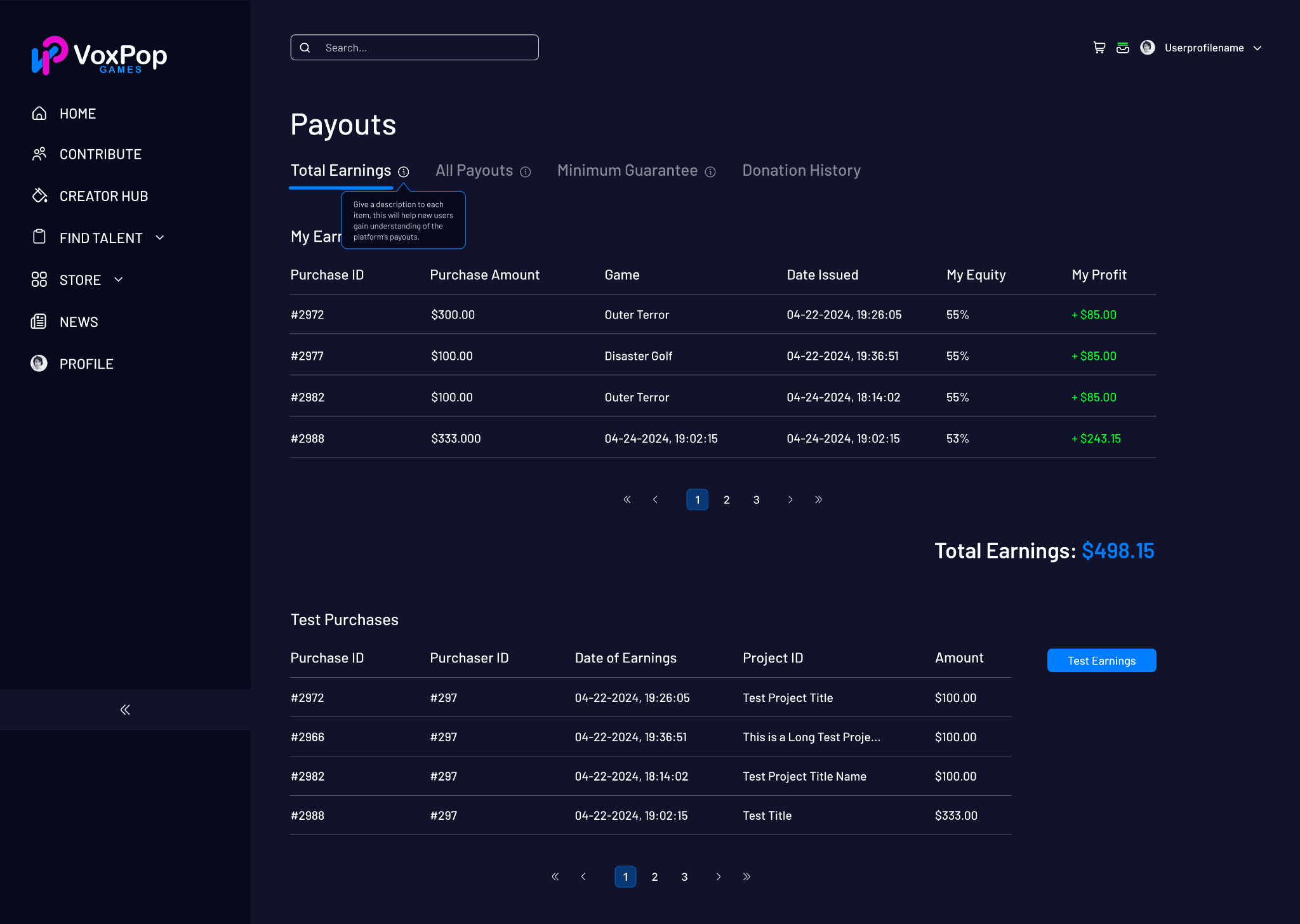
The payout dashboard was a trust-critical surface; contributors needed to understand exactly what they'd earned, from which games, and why. I designed a tabbed earnings view (Total Earnings / All Payouts / Minimum Guarantee / Donation History) with a transaction table showing Purchase ID, Purchase Amount, Game, Date, Equity Percentage, and Profit in a clean, scannable layout. Total earnings displayed prominently at the bottom of the table. An added “Test Earnings” function allowed developers to simulate payout scenarios before launch.
Equity percentages visible on the Members panel of the Project Management page gave contributors transparency into how their stakes compared with those of teammates.
Reflection
Designing 115 screens without a design system placed heavy decision-making on me as the designer and the development team, as everything either made the platform more consistent or strayed from the branding. Looking back, the absence of a formal component library created friction in the later stages of the project, when screen counts were high, and UX inquiry began to multiply.
What I'd do differently: Advocate for a minimal design system up front, not as just a ‘nice-to-have’. Even a lightweight library, colors, type scale, and spacing would have significantly accelerated the back half of the project and reduced annotation overhead during handoff.
This project also marked a transition point in my practice. I moved from Adobe XD to Figma shortly after, and the constraints of working without a live component library on a project this large were a significant factor in that decision.
Related Work
Consulting & Brand Repositioning
UX Consulting for a Legacy Gaming Studio
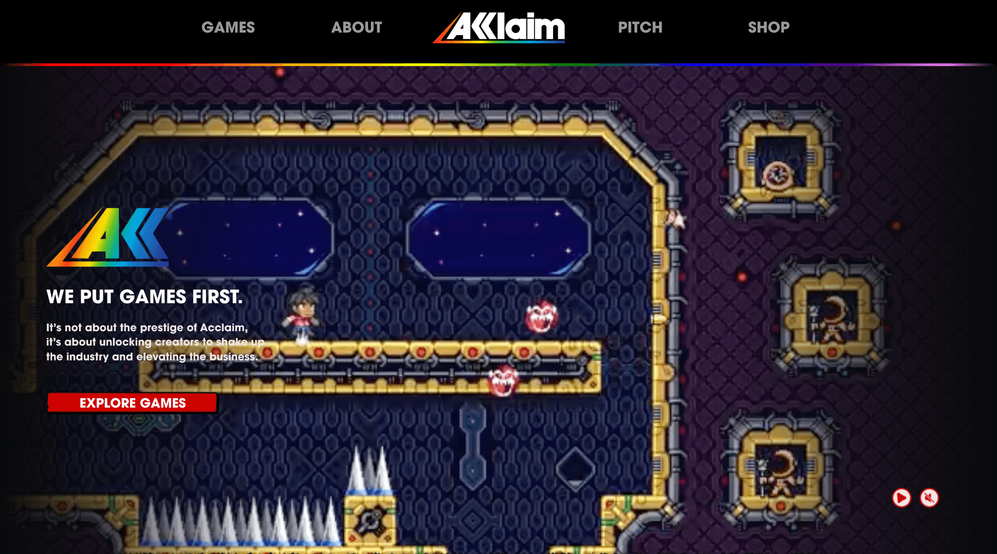
Auditing a relaunched gaming publisher, Play Acclaim, high-fidelity prototypes ahead of development to correct legacy brand disconnect, and deliver a roadmap for internal implementation.
Product Design & Development
Website Quality Audit Web App
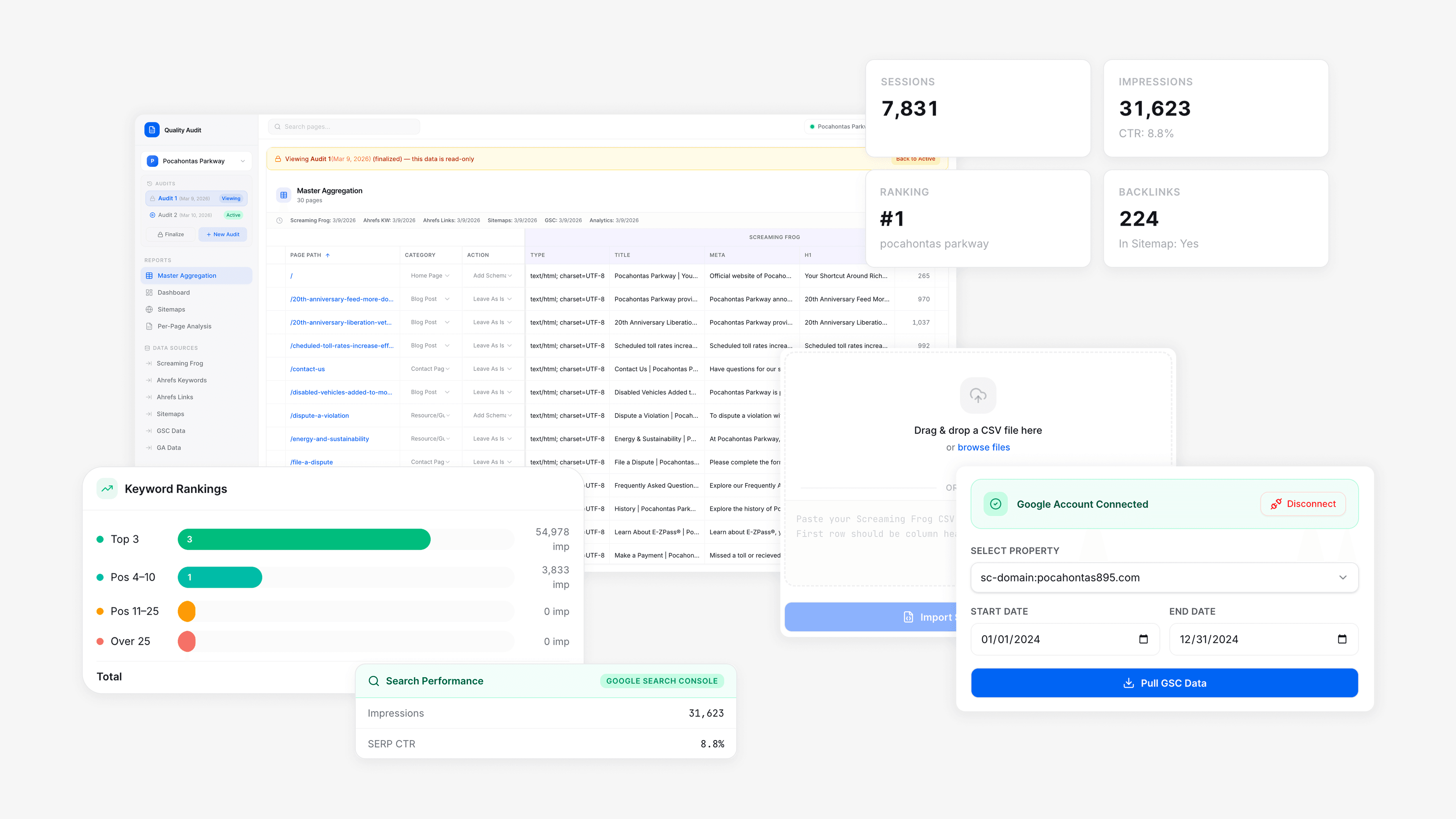
Self-serve SEO audit dashboard that replaced an outdated spreadsheet tool, cut audit timeline by 55%, and permits clients a live view into their own technical and content data.