Website Redesign & Prototyping
High-Fidelity Website Prototyping for Immigration Platform
NicheProfile EB-1A Advisory Platform & AI Portal · nicheprofile.io
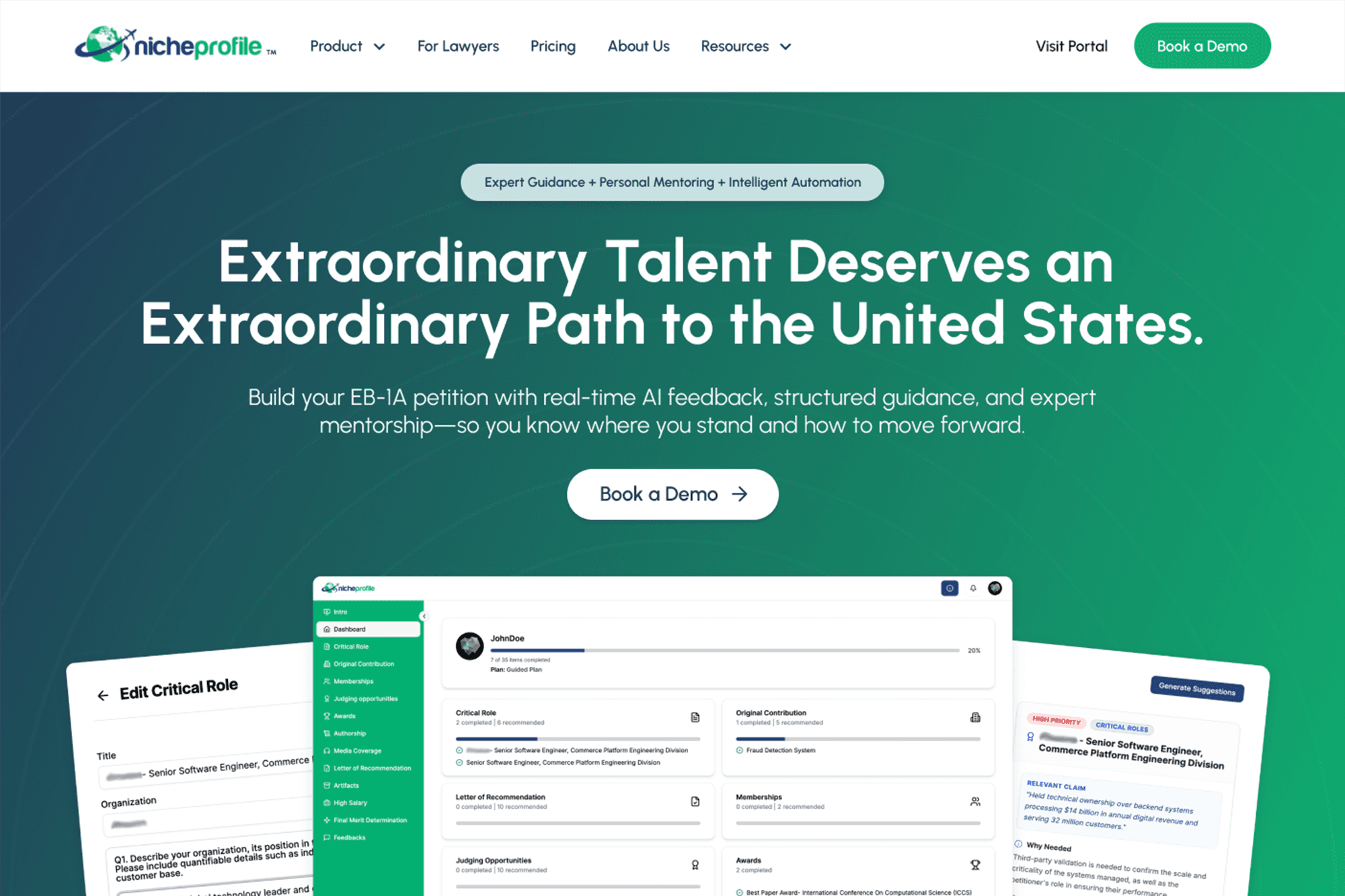
The Challenge
EB-1A is one of the most complex and high-stakes immigration categories in the US. Defined as an “extraordinary ability” visa with a demanding evidentiary standard, typically navigated with expensive legal counsel. NicheProfile was built on the premise that self-filers could access AI-assisted tools, expert human mentorship, and a peer community to build their own petition without a $15,000–$50,000 in legal fees.
Three problems converged at once:
- A product without an established category: NicheProfile isn't a law firm, a course, or a chatbot. It's a SaaS platform with AI-trained USCIS-alignment models, human mentorship, and community peer review all in one. While a few ‘direct’ competitors exist, none have a portal as robust or as well-trained in keeping pace with evolving immigration standards.
- Two fundamentally different audiences with competing expectations: The portal's users are individual EB-1A self-filers, high-achievers who are intelligent and motivated but navigating an unfamiliar legal process. They need confidence, clarity, and a sense of guided progression to organize and document their accomplishments. The secondary audience is immigration law firms seeking a white-label enterprise portal tailored to their firm's unique expertise. They need credibility, infrastructure, language, and ROI framing. The primary goal for the new website was to serve both without diluting either.
- A portal that existed but couldn't be redesigned: The AI portal itself was a prebuilt product and not in scope for redesign. But users purchasing access would be dropped into it cold after checkout. Designing the gap between “I just bought this” and “I know exactly what I'm walking into” became one of the most consequential UX problems on the project.
Collaboration model
The CEO and Founder was himself an EB-1A recipient, which meant the subject matter expertise in the room was unusually deep. He understood the emotional arc of the visa process, the anxiety/pain points, progress fall-offs, and the language that signals credibility to USCIS reviewers.
The collaboration was structured around that division of expertise: he owned domain knowledge and content direction; I owned every word that appeared in the interface. All UX copy (headlines, CTAs, labels, microcopy, pricing page language, onboarding instructions) was written by me and refined across multiple review sessions to align with industry terminology and the platform's positioning. This ensured the product read like a credible authority rather than a startup overpromising.
The Process
1. Phased site architecture
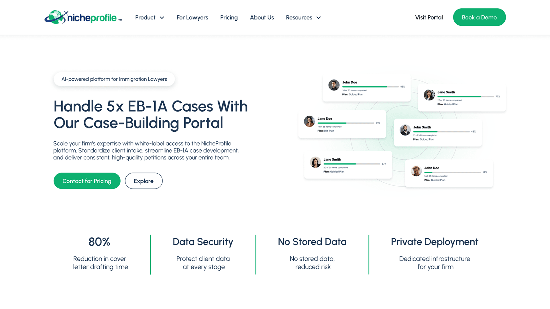
The full site scope was defined upfront and built in phases. Rather than designing separate sites or experiences for self-filers and law firms, I structured the IA so that both audiences could self-identify and route themselves without friction.
The initial campaign landing page led with the self-filer story, centered on the EB-1A journey. Legal teams were not targeted in this initial campaign, as we first targeted first-time filers and recently rejected applicants.
The campaign funnel covered:
- Landing page with the sole conversion of booking a portal demo
- Tiered pricing/e-commerce flow for instant purchasing
- Calendly booking for portal demos
Once the campaign was running steadily, I transitioned to the full redesign of the existing sitemap.
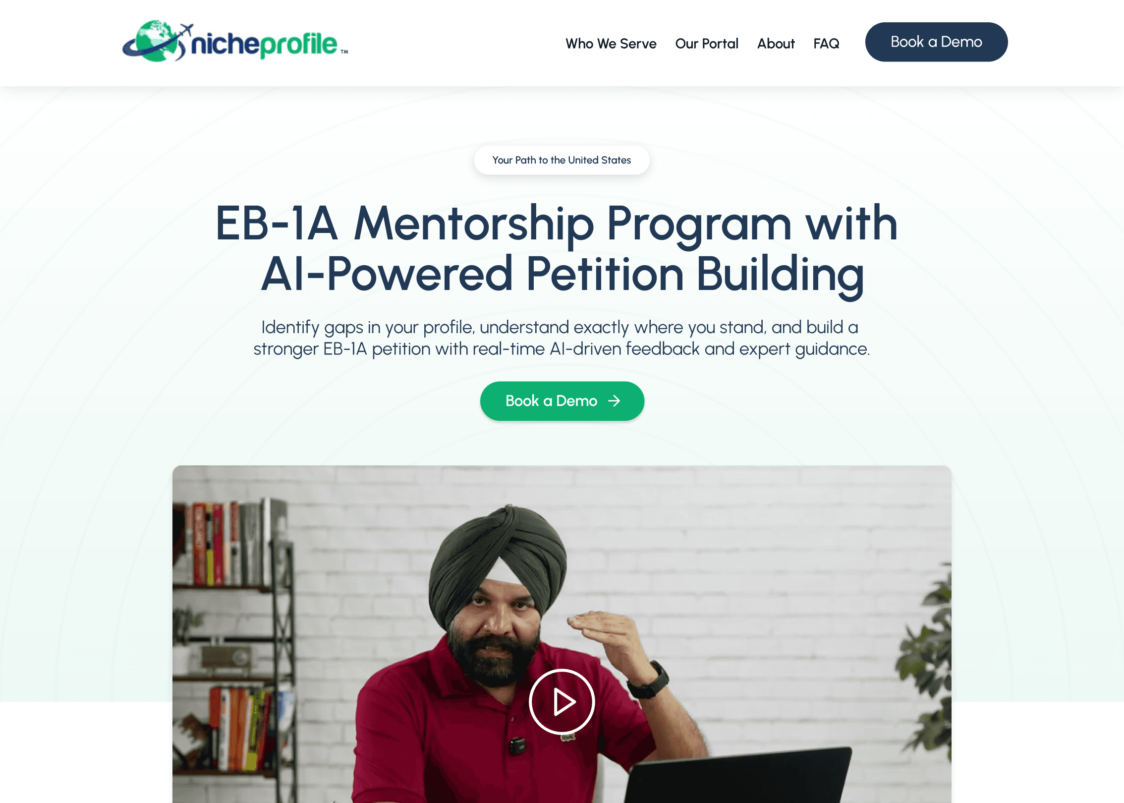
2. Positioning an uncategorized product
The biggest messaging challenge was making the platform legible without a category to anchor it. I structured the hierarchy of communication as:
Problem → Credibility → System → Proof → Action
Lead with the problem the user already feels (the EB-1A process is complex, tedious, and expensive with legal communication). Establish credibility through the founder's own EB-1A story and USCIS-trained model specificity. Explain the system of AI-coach + human mentor + community in a way that makes each component feel additive. Surface social proof and mentor credentials. Funnel users to book platform demos with the founder or purchase portal access.
3. Designing the three-tier e-commerce flow
The pricing architecture required three distinct conversion paths, each with a different emotional register:
DIY Tier: Self-guided portal access with an AI coach, portal video instructions, and 3 mentor review sessions. Copy was positioned around autonomy and cost efficiency for self-sufficient applicants who want AI-powered tools and minimal hand-holding.
Guided Tier: Portal access until their application is accepted, 6+ mentor sessions, peer community of the platform's filers, AI + human review of all bundle assets, including Letters of Recommendation. Copy was positioned around confidence and thoroughness for applicants who want to self-file with meaningful expert support at every stage.
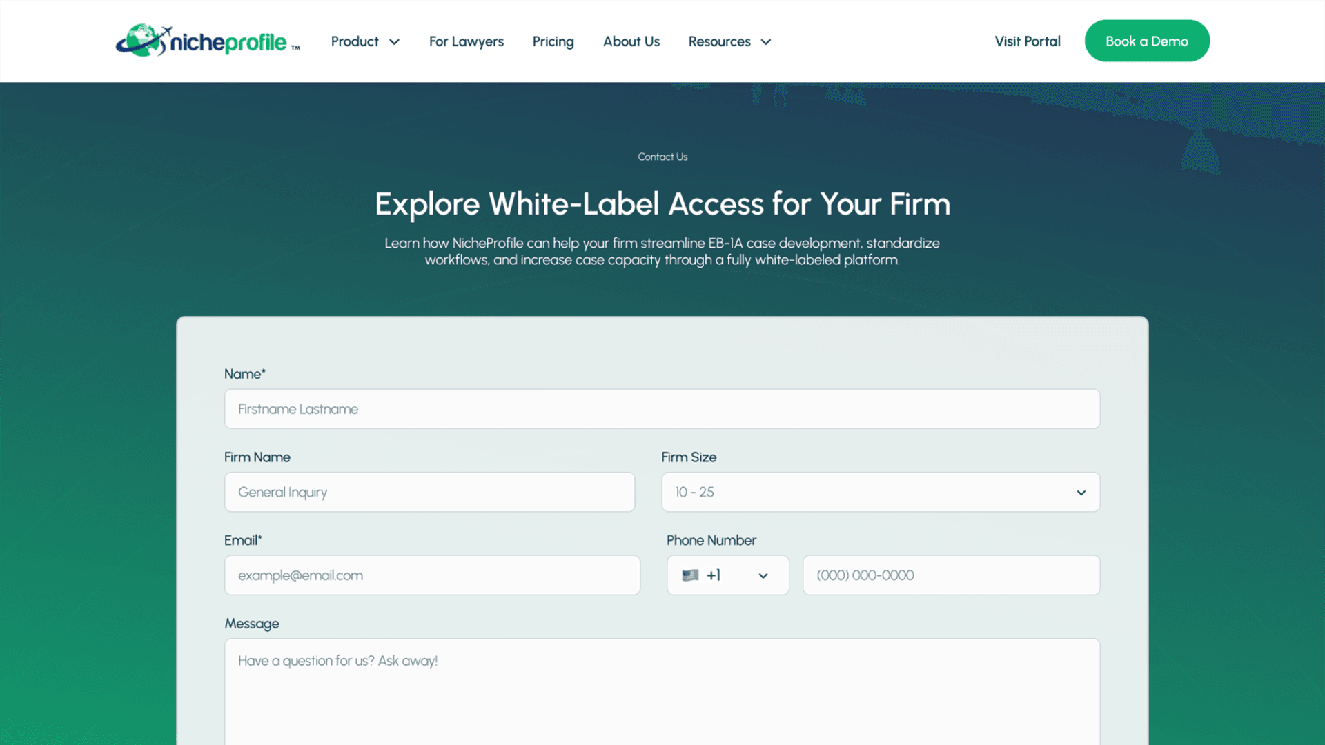
Enterprise/Legal Firm Tier: Custom pricing, white-label portal, models trained on firm-specific expertise, cloud infrastructure. Copy was shifted entirely to B2B language on ROI, deployment, client security, and increased caseload. Designed to help legal teams see the platform as a competitive advantage for scaling their firms.
Each user tier had its own CTA language, feature comparison, and downstream onboarding experience designed to reduce post-purchase confusion and set accurate expectations before users touched the portal.
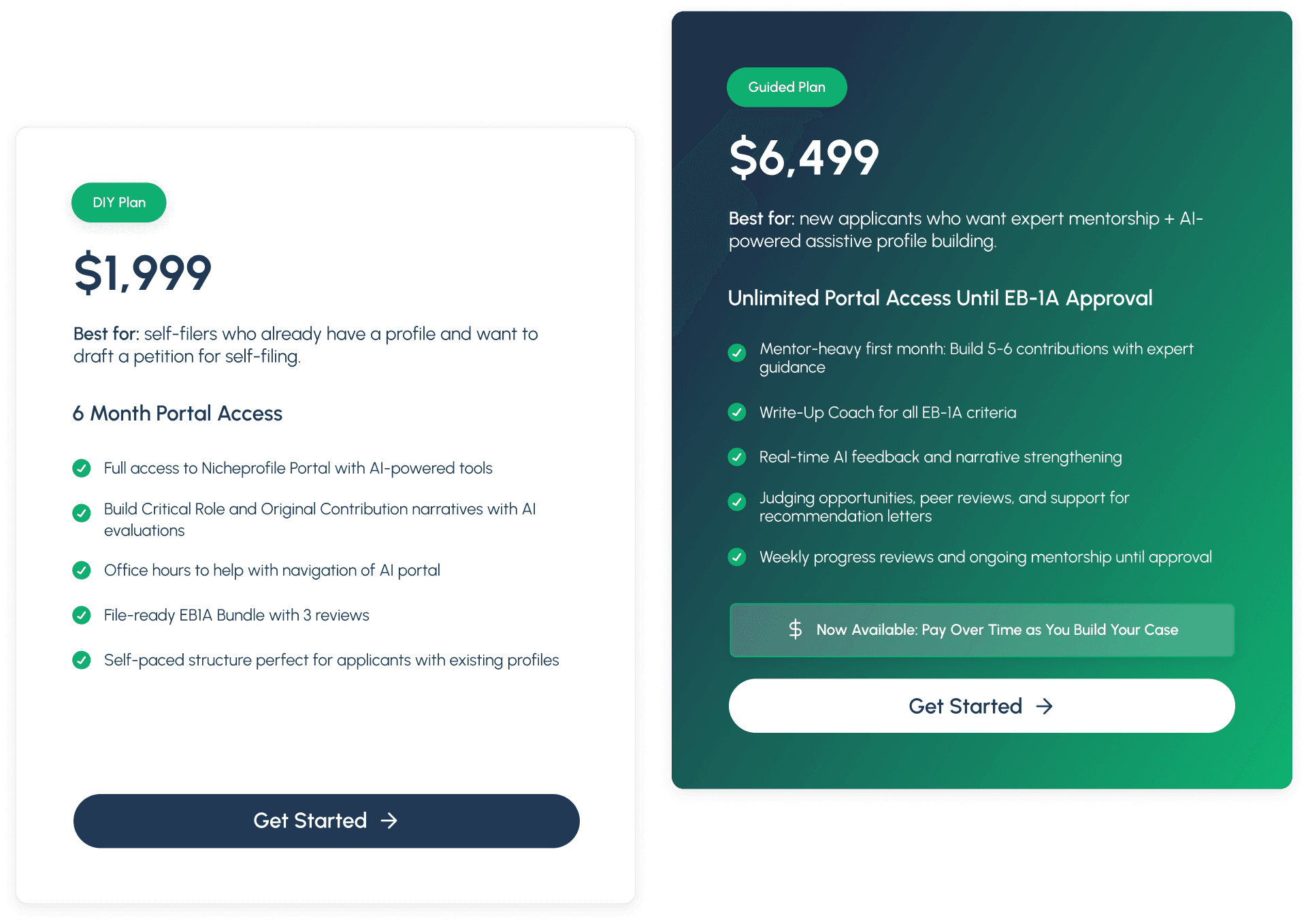
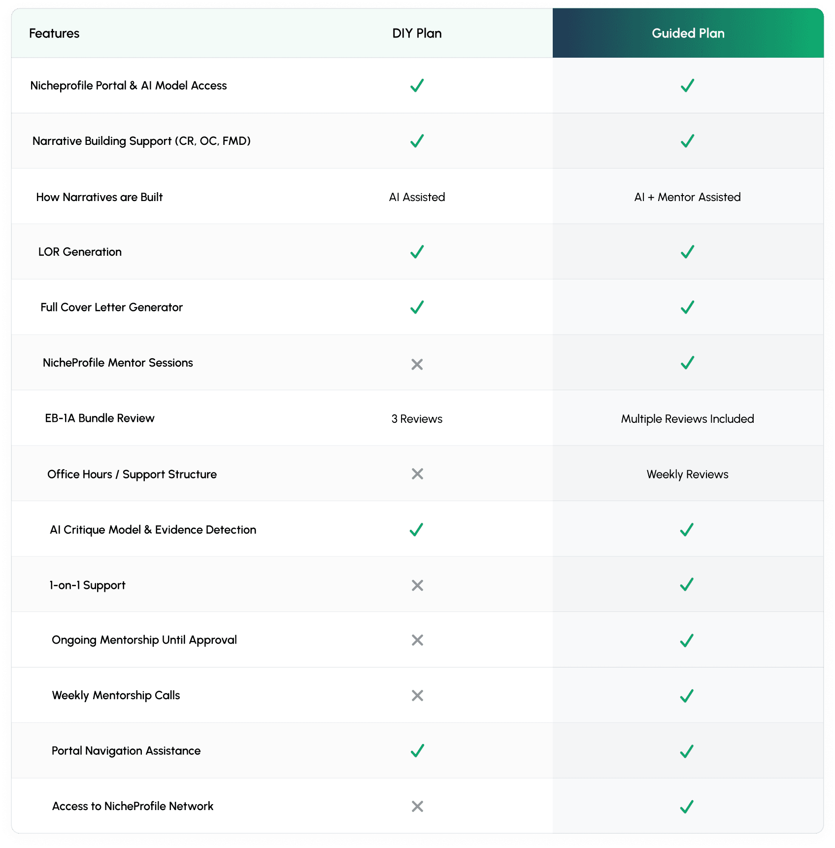
DIY and Guided pricing tiers, with a feature-by-feature comparison to help self-filers choose the right level of support.
4. Bridging the post-purchase gap
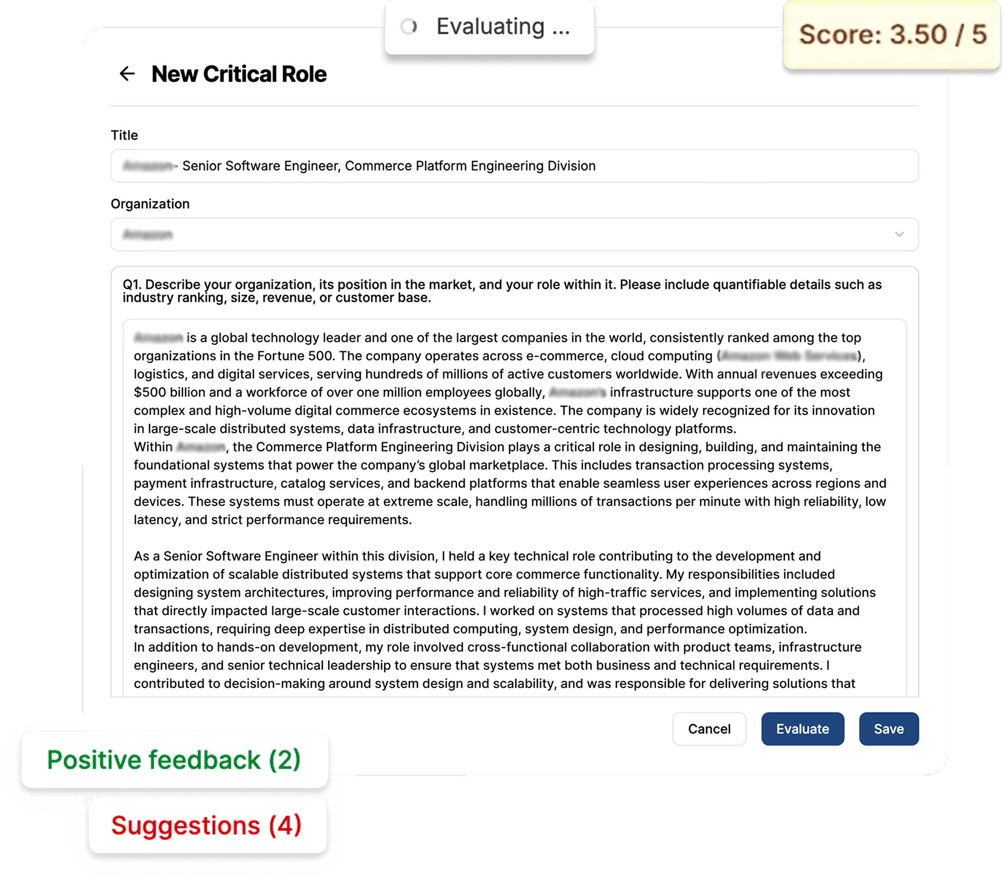
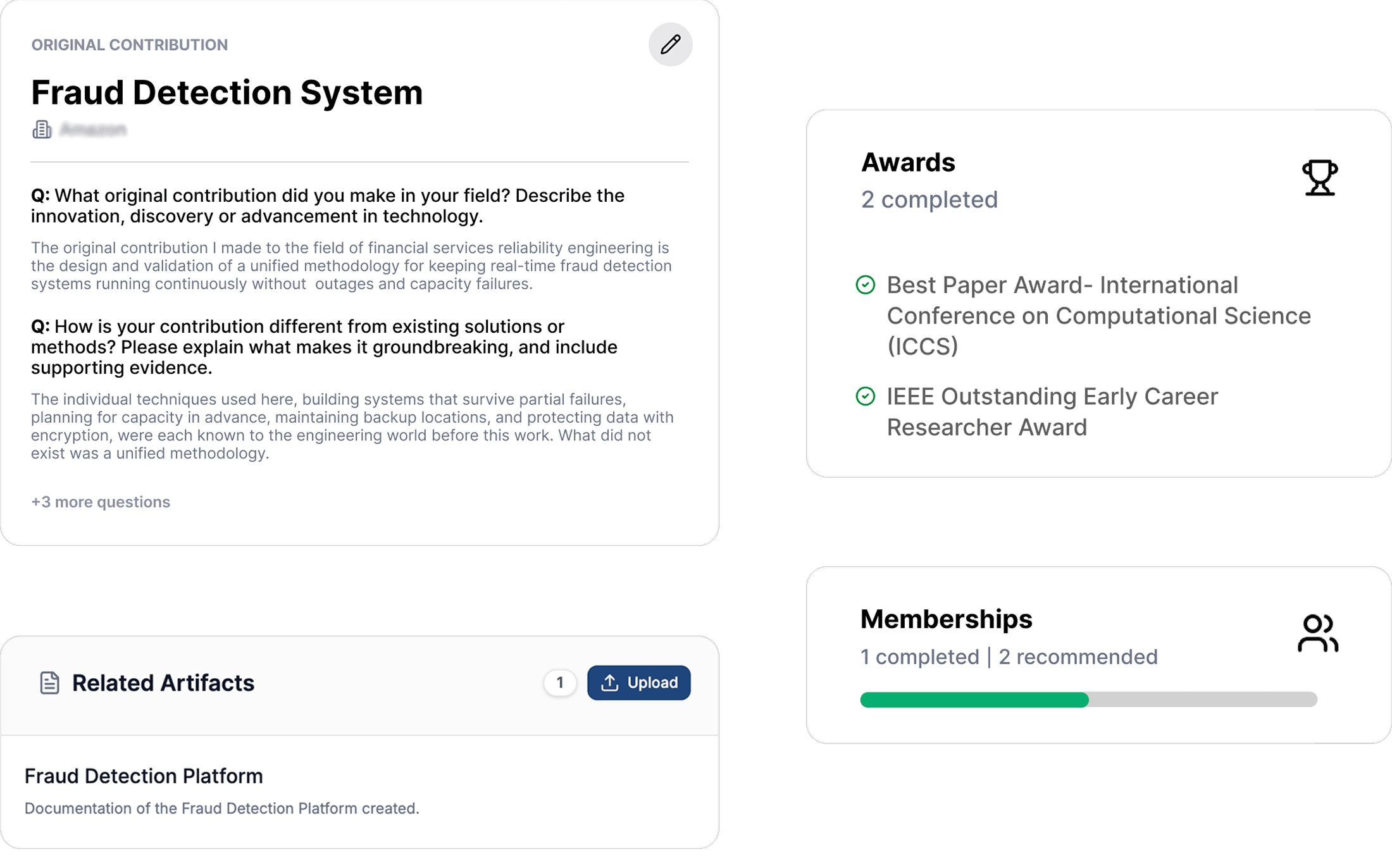
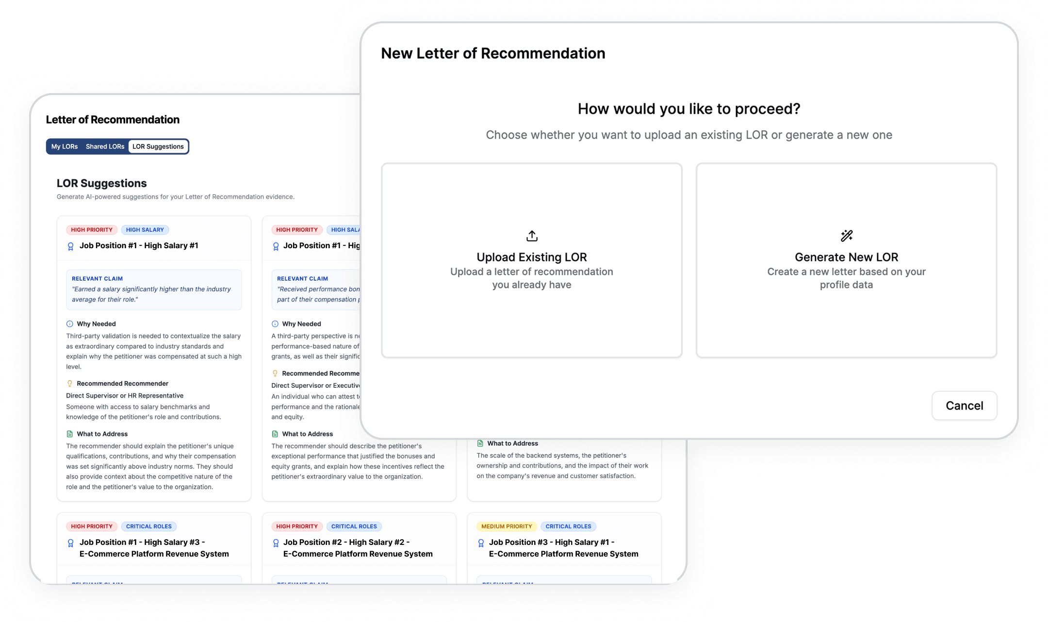
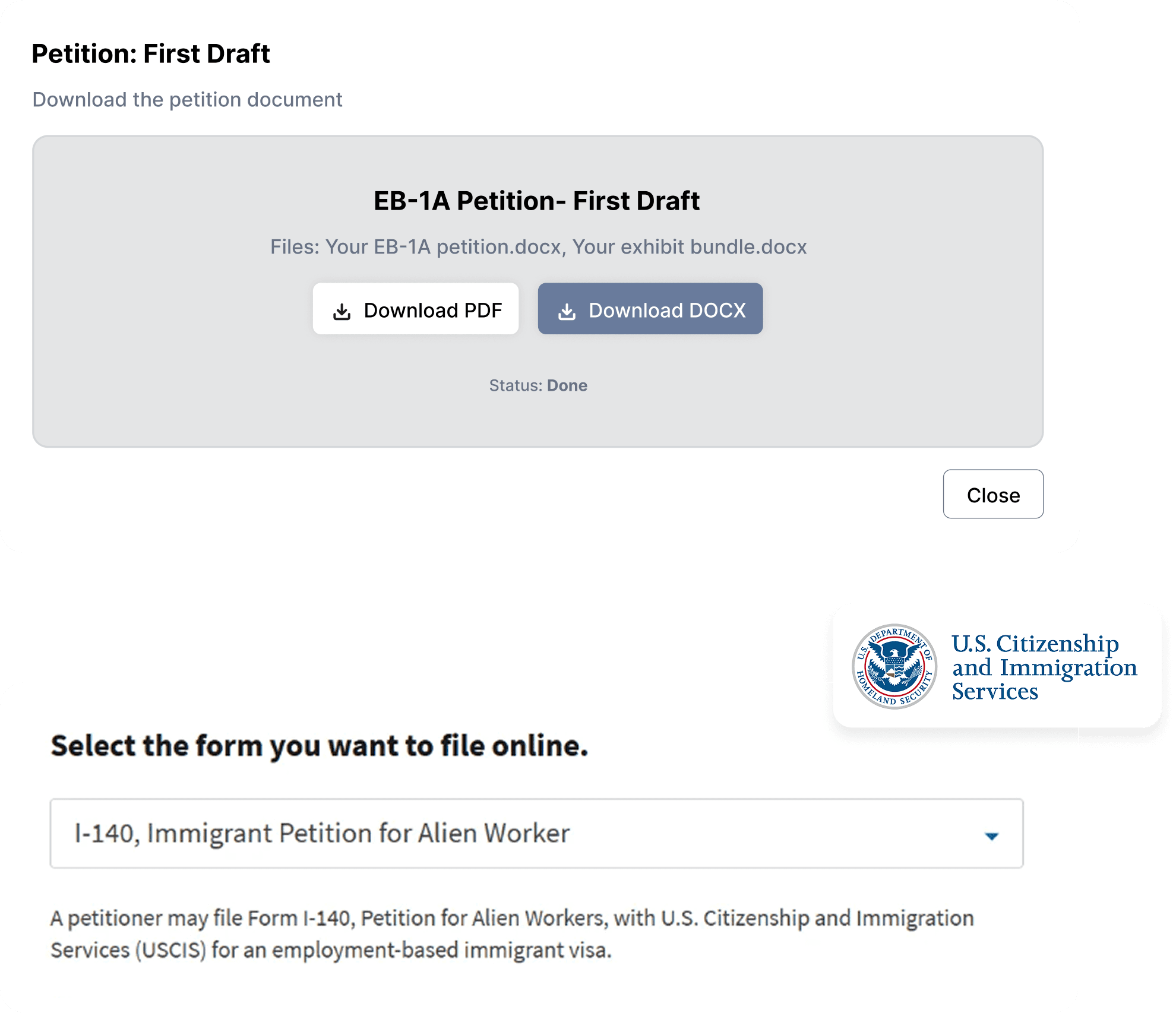
Because the AI portal itself was pre-built and outside the design scope, there was an inherent UX risk: users who purchased access are dropped into an unfamiliar dashboard without context. I designed a suite of custom portal preview graphics, illustrations, and annotated UI screenshots that introduced the portal's key features and processes before users ever logged in. These appeared on the feature overview pages, targeted for new applicants or recently rejected applicants, and in onboarding touchpoints:
- Smart Writeup AI Coach: how the AI guides narrative construction
- Real-time USCIS content flagging: how the model flags language against USCIS standards as you write
- Bundle asset review: how mentor and community feedback is surfaced within the portal
- Step indicators and progress mapping: giving users a mental model of where they are in the petition process
The goal was for a new user's first login to feel like arriving somewhere familiar and to align with the existing documentation and tutorials in the portal.
5. Copywriting as a UX layer
Every piece of text in the interface was written to do design work. In a product this conceptually dense, weak copy creates friction that no visual design can fix. Key decisions:
- CTAs avoided generic language (“Get Started,” “Learn More”) in favor of progress-oriented framing (“Book a Portal Demo,” “Explore Plans”)
- Pricing page labels named the user's identity and expectation level, not the feature set
- Microcopy on form fields and portal preview graphics used accurate USCIS terminology to signal authority to legally sophisticated users while remaining accessible to first-time applicants
6. Component library + developer handoff
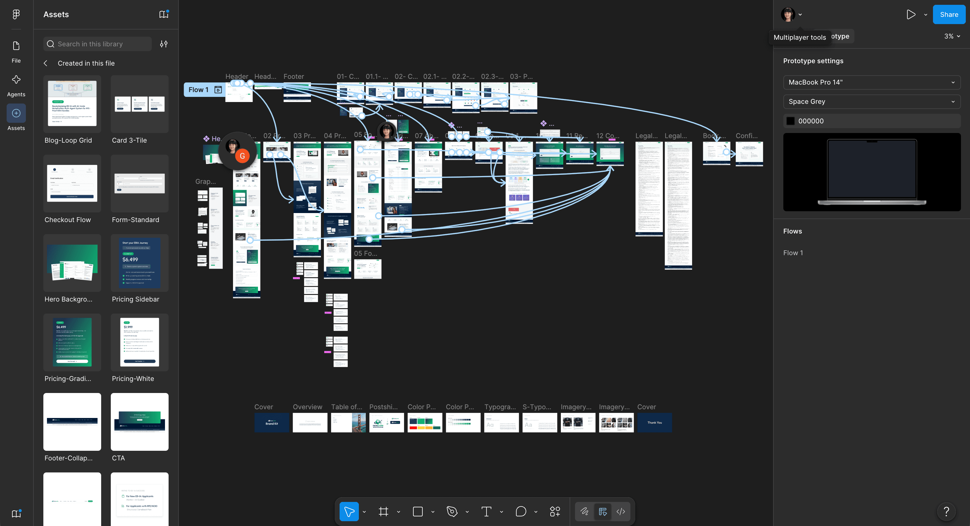
To bridge the design-to-build gap with an international development team, I built a comprehensive Figma component library that complements NicheProfile's existing design system and brand. Deliverables included:
- Full high-fidelity Figma file with all pages and states documented
- Component library with consistent naming conventions for dev reference
- Custom graphics packaged and export-ready
- Handoff documentation covering spacing, interaction notes, responsive behavior, and copy specifications
- Post-handoff QA involvement to flag misalignments between the built product and Figma specifications
Outcomes
This project had no hard post-launch metrics available at the time of the engagement; the site was handed to an international development team for build, and the reporting relationship ended at QA. The measurable outcomes are in the deliverables and decisions themselves:
- A full website and e-commerce flow designed and documented for a niche product
- Three distinct conversion flows serving audiences with fundamentally different purchasing psychology and timelines
- Portal expectation and timeline graphic systems that solved the post-purchase UX drop-off
- A copywriting layer refined through multiple stakeholder review sessions with a subject matter expert, resulting in interface language that holds up to legal industry scrutiny
Reflection
NicheProfile was the most intellectually demanding positioning project I've worked on. Most UX problems have a recognizable shape: users know what a payment page, an FAQ, and a SaaS dashboard are. This project required building comprehension from the ground up for a product with no direct reference point.
The decision I'm most proud of: treating the post-purchase gap as a design problem rather than a product problem. The portal couldn't be redesigned, but the expectations for it could be. I aimed to help angle how the user experiences the product and build familiarity, all before the first login.
What I'd do differently: With an international development team working across time zones, the margin for misinterpretation widens with every layer of abstraction between design intent and built output. Even with careful developers, there are always translation gaps like spacing that reads differently in code, interactive states that get inferred rather than specified, and component variants that get consolidated when they shouldn't be.
On the next engagement of this scale, I'd invest more upfront in the handoff infrastructure itself: stricter component-naming conventions, explicit do/don't annotations for complex interactions, and a living QA checklist tied directly to Figma frames rather than to general feedback rounds.
Related Work
UX/UI Strategy & Development
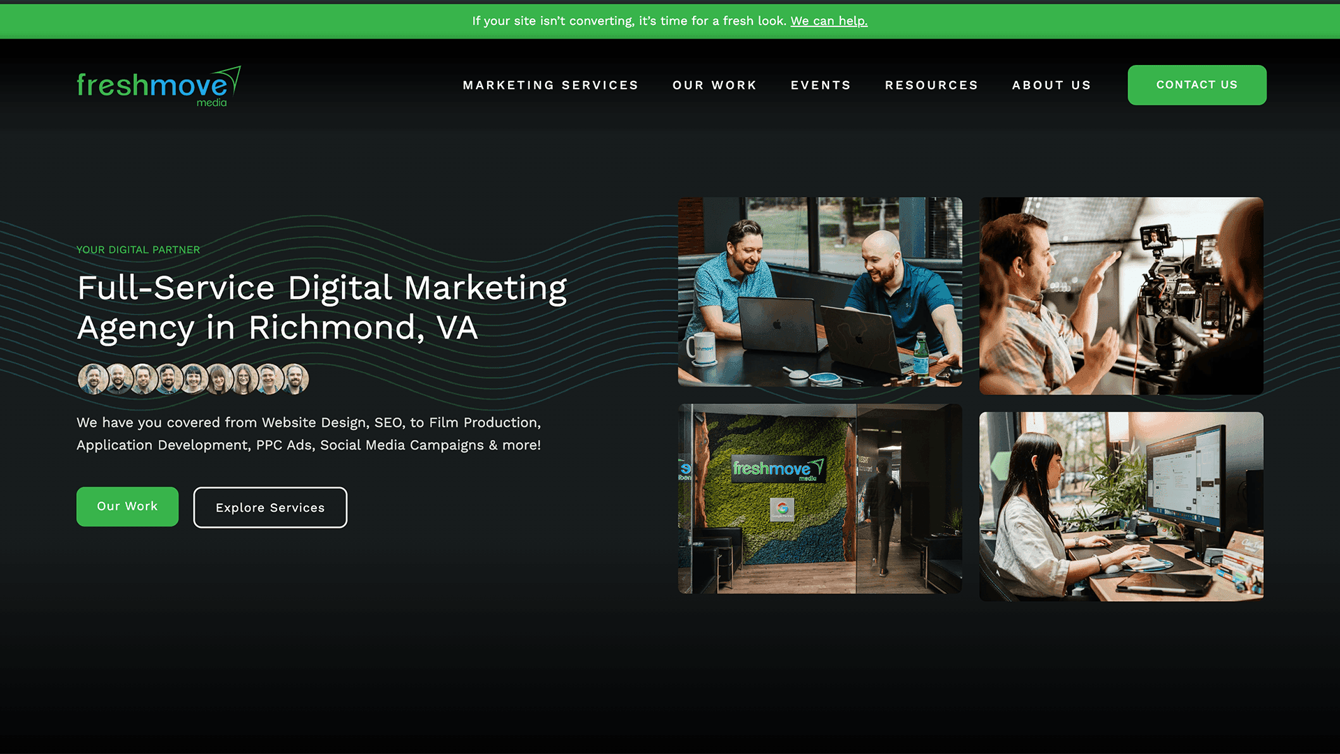
Agency Website Design, Development, & UI System Build
Leading the redesign of a website design agency's own website, a scalable UI system, restructured IA, and a content engine built for organic growth.
Website UX/UI Design & Development
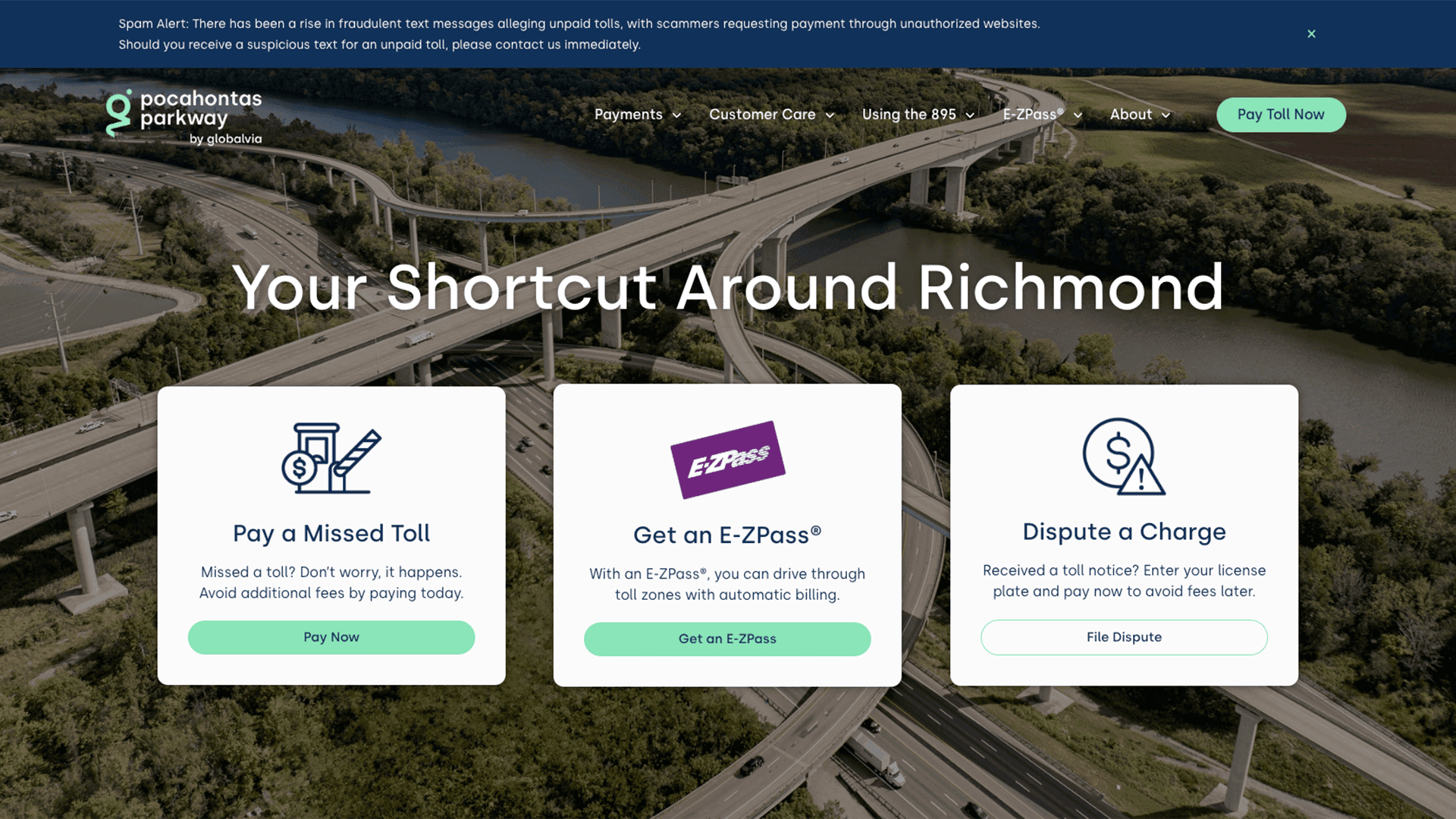
Website Design & Development for Major Toll Roadway
Full redesign of a public toll authority, Pocahontas Parkway 895, website. Centered around restructuring payments, managing toll disputes, and promoting E-ZPass.