Website UX/UI Strategy & Development
Agency Website Design, Development, & UI System Build
FreshMove Media · freshmovemedia.com
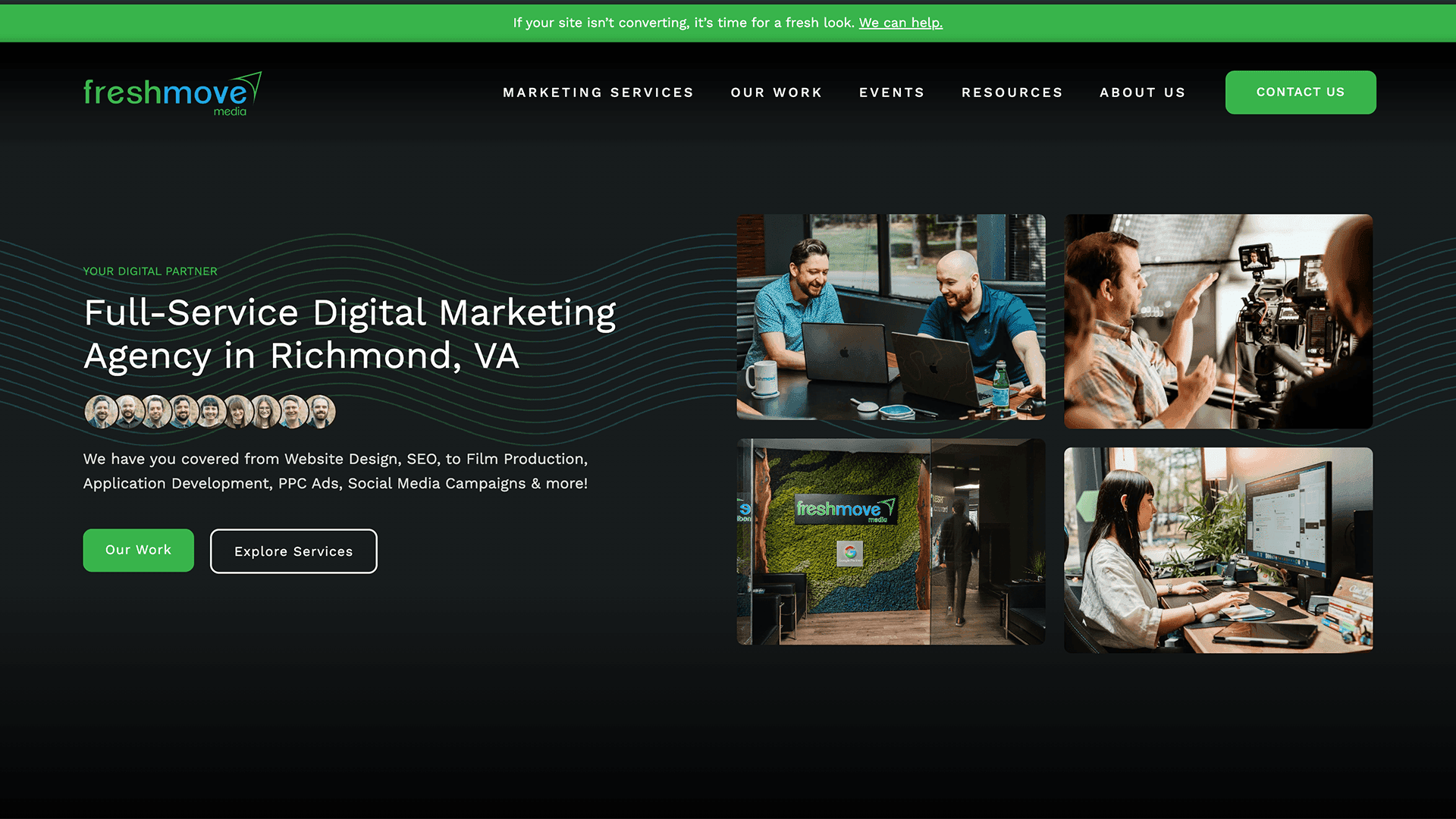
The Challenge
Redesigning your own agency's website is one of the hardest briefs in the industry. The client is everyone: leadership, sales managers, paid media specialists, content creators, and creatives, all with strong opinions and competing priorities that make them the powerhouse creatives they are.
As this was the third iteration of freshmovemedia.com, I was not only shaping the future of our digital positioning but paying homage to the web developers before me. Since it wasn't a blank-slate redesign, this project served as an opportunity to sharpen the brand, fix what wasn't working, and build a scalable SEO foundation.
The problems:
- Inconsistent visual language across pages with no shared component system
- Information architecture that talked about the agency rather than communicating value to prospective clients
- No SEO infrastructure to support organic lead generation
- A portfolio experience that didn't do justice to the quality and breadth of client work
The Process
1. Stakeholder alignment
Before jumping into a Figma file, I facilitated alignment sessions across departments to surface priorities, flag conflicts early, and build consensus around a shared direction. This prevented late-stage design pivots and kept the project moving.
2. Restructuring the information architecture
Most agencies make the mistake of centering their site around themselves. I restructured the IA to lead with outcomes for the client through keyword-rich service pages that articulate capability, and case studies that demonstrate real impact. One alignment from the entire team was to reposition FreshMove as a strategic full-service marketing partner.
3. Building the UI system
Rather than designing pages in isolation, I built a component library first, consisting of:
- Typography scale, weight, and hierarchy rules
- Button states and interactive patterns
- Card components, form elements, spacing tokens
- Navigation patterns and content layout templates
As this UI kit was not exclusive to the website, I positioned this as an extension of our pre-existing brand guidelines for future digital products and campaign assets, giving the brand a consistent visual language across platforms.
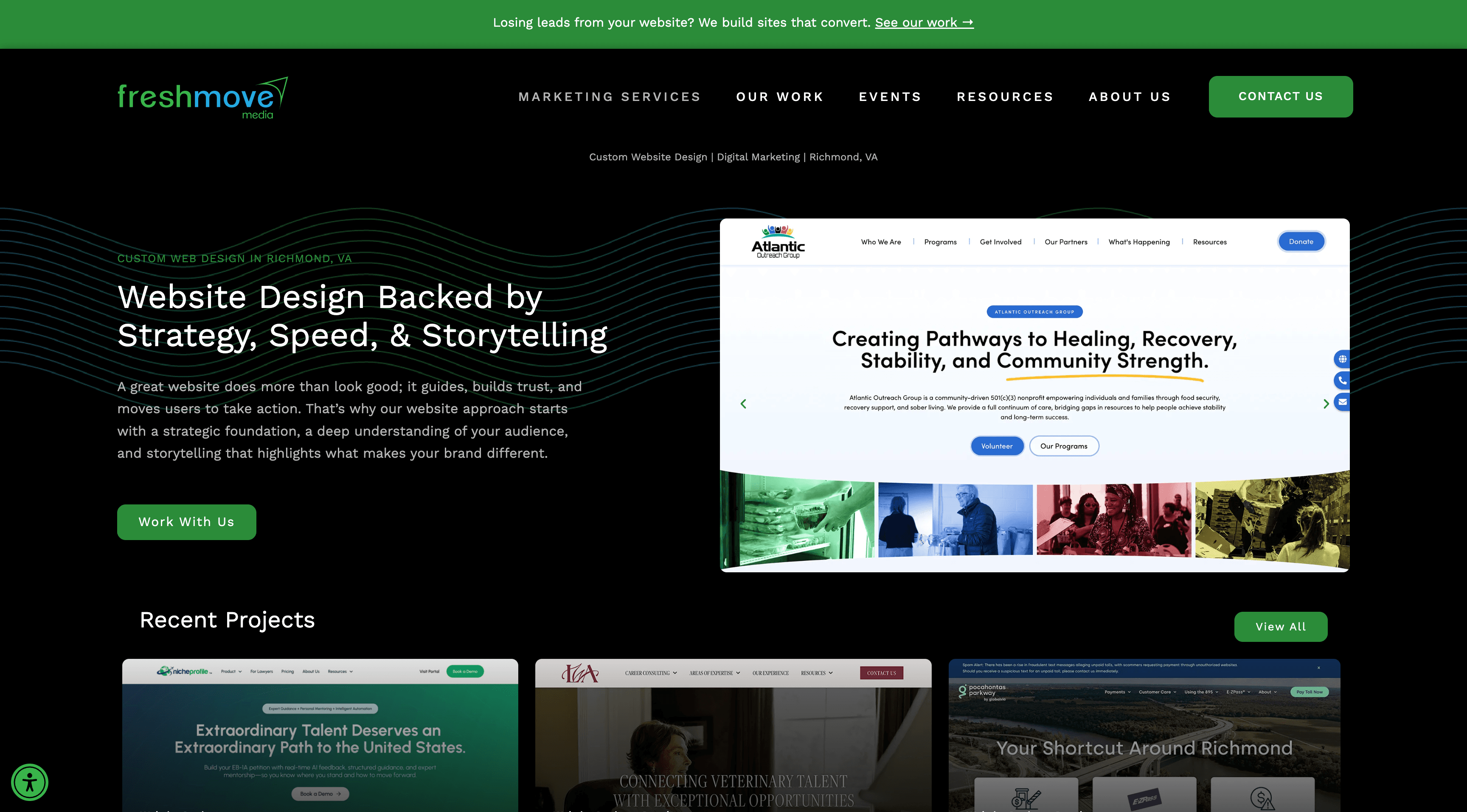
4. Designing for movement
Motion is at the core of the creative work we do. I integrated purposeful animations, such as GIFs, videos, and interactive micro-moments, to reflect the agency's creative identity without adding noise.
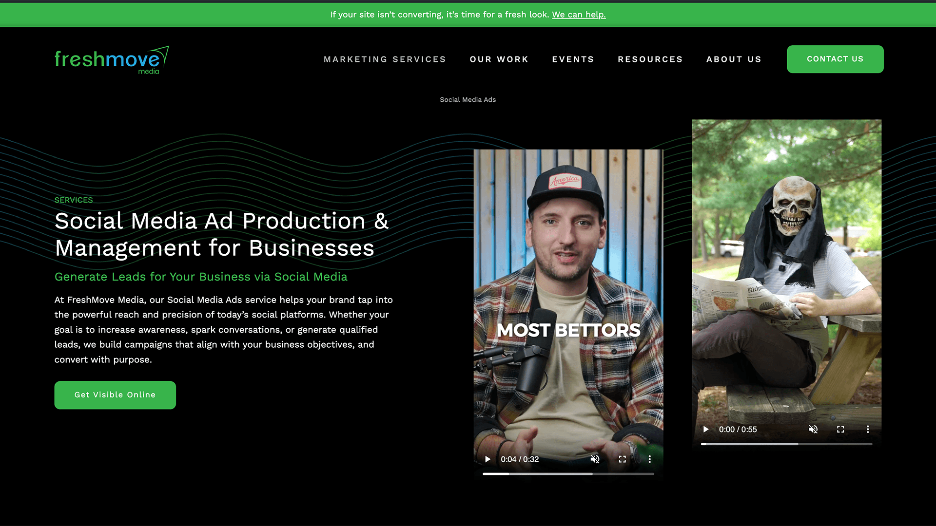
5. Rethinking the case studies
The previous portfolio layout and case study structure wasn't doing the work justice. I landed on a masonry-style gallery system anchored by strong hero imagery, concise project problems and solutions, and a clear visual hierarchy designed to spark wonder and curiosity and encourage deeper exploration.
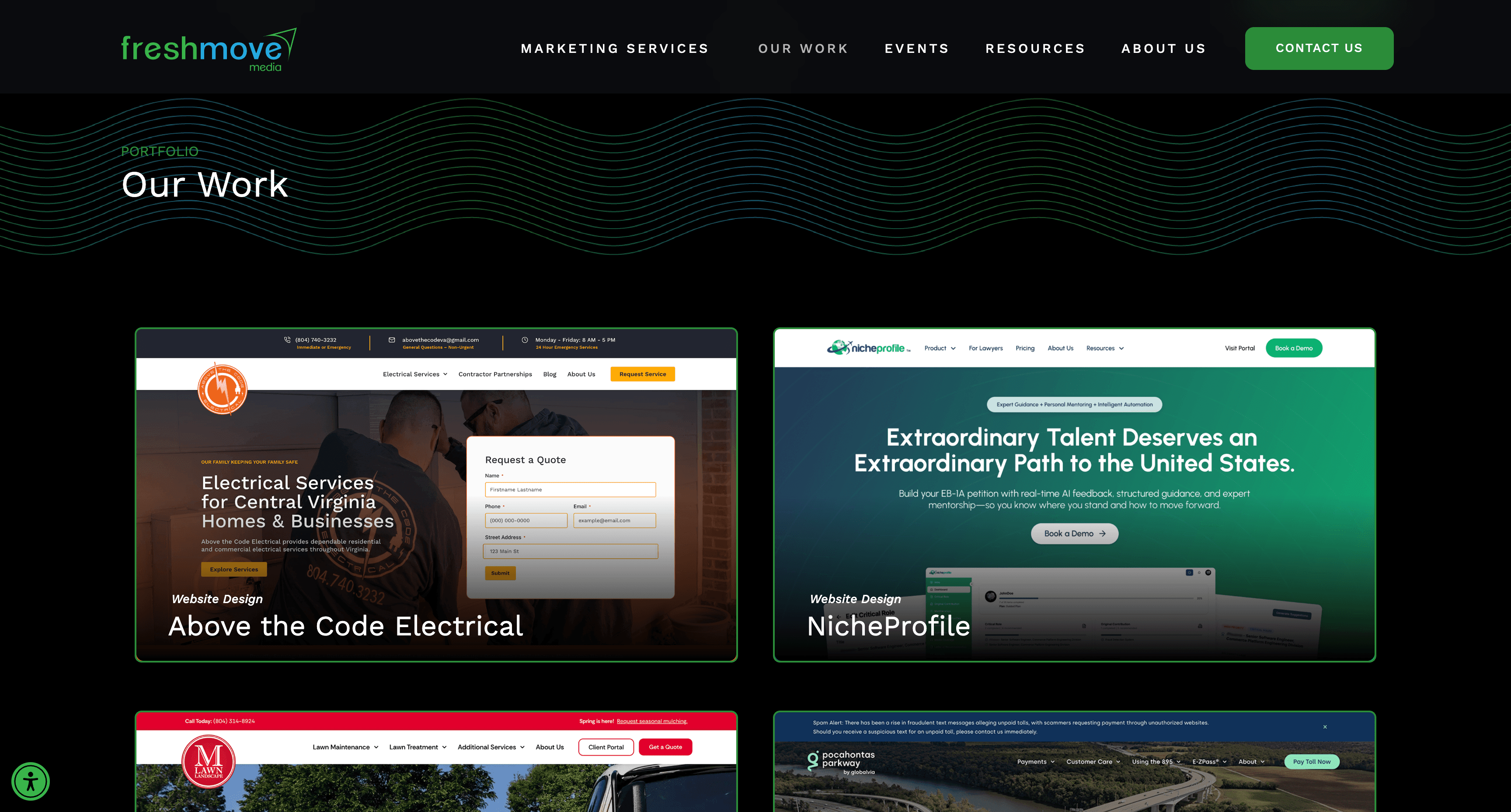
6. SEO infrastructure
The redesign included a full SEO layer: landing pages targeting service and regional search intent, blog and case study production workflows, schema, and on-page optimization baked into the component system from the start. Organic discovery and conversion are now designed to work together in an intentional cross-linking strategy.
Tools Utilized
Outcomes
Performance
Core Web Vitals
LCP
- Before Redesign
- 3.7s (Poor)
- After Redesign
- 0.6s (Excellent)
- Change
- ↓ 1.9s
INP
- Before Redesign
- 245ms (Fair)
- After Redesign
- 42ms (Good)
- Change
- ↓ 203ms
CLS
- Before Redesign
- 0.21 (Poor)
- After Redesign
- 0.001 (Excellent)
- Change
- ↓ 0.209
| Metric | Before Redesign | After Redesign | Change |
|---|---|---|---|
| LCP | 3.7s (Poor) | 0.6s (Excellent) | ↓ 1.9s |
| INP | 245ms (Fair) | 42ms (Good) | ↓ 203ms |
| CLS | 0.21 (Poor) | 0.001 (Excellent) | ↓ 0.209 |
Lighthouse Scores
Performance
- Before Redesign
- 70/100 (Fair)
- After Redesign
- 100/100 (Excellent)
- Change
- ↑ 30pts
Accessibility
- Before Redesign
- 65/100 (Fair)
- After Redesign
- 85/100 (WCAG 2.1 Level AA, Good, Supplemental Support from Userway Widget)
- Change
- ↑ 20pts
Best Practices
- Before Redesign
- 100/100 (Excellent)
- After Redesign
- 100/100 (Excellent)
- Change
- Maintained
SEO
- Before Redesign
- 66/100 (Fair)
- After Redesign
- 98/100 (Excellent)
- Change
- ↑ 32pts
| Metric | Before Redesign | After Redesign | Change |
|---|---|---|---|
| Performance | 70/100 (Fair) | 100/100 (Excellent) | ↑ 30pts |
| Accessibility | 65/100 (Fair) | 85/100 (WCAG 2.1 Level AA, Good, Supplemental Support from Userway Widget) | ↑ 20pts |
| Best Practices | 100/100 (Excellent) | 100/100 (Excellent) | Maintained |
| SEO | 66/100 (Fair) | 98/100 (Excellent) | ↑ 32pts |
Traffic
Organic sessions (3 months post-launch)
- Result
- ↑ 58% increase in clicks
↑ 129% increase in impressions
Top landing pages from SEO build
- Result
- 116 pages and blogs ranking in positions #1–3
185 pages and blogs ranking in positions #4–10
| Metric | Result |
|---|---|
| Organic sessions (3 months post-launch) | ↑ 58% increase in clicks ↑ 129% increase in impressions |
| Top landing pages from SEO build | 116 pages and blogs ranking in positions #1–3 185 pages and blogs ranking in positions #4–10 |
Internal impact
- UI system reduced new page build time by eliminating per-page design decisions
- Stakeholder approval process streamlined through documented design rationale and a shared Figma component library
- Case study workflow established as an ongoing content engine, not a one-time deliverable
Reflection
Leading a redesign where every creative on the team is also a stakeholder is a discipline in itself. The hardest part wasn't the design, but facilitating decisions across my peers with competing priorities while maintaining a clear creative vision.
The UI system was the most lasting output of this project. It shifted the team's thinking about the website from a static artifact to a breathing, scalable product.
What I'd do differently: Earlier alignment on SEO goals would have shaped the IA decisions from day one, rather than layering them in post-wireframe. The two workflows ended up informing each other and should have started together.
Related Work
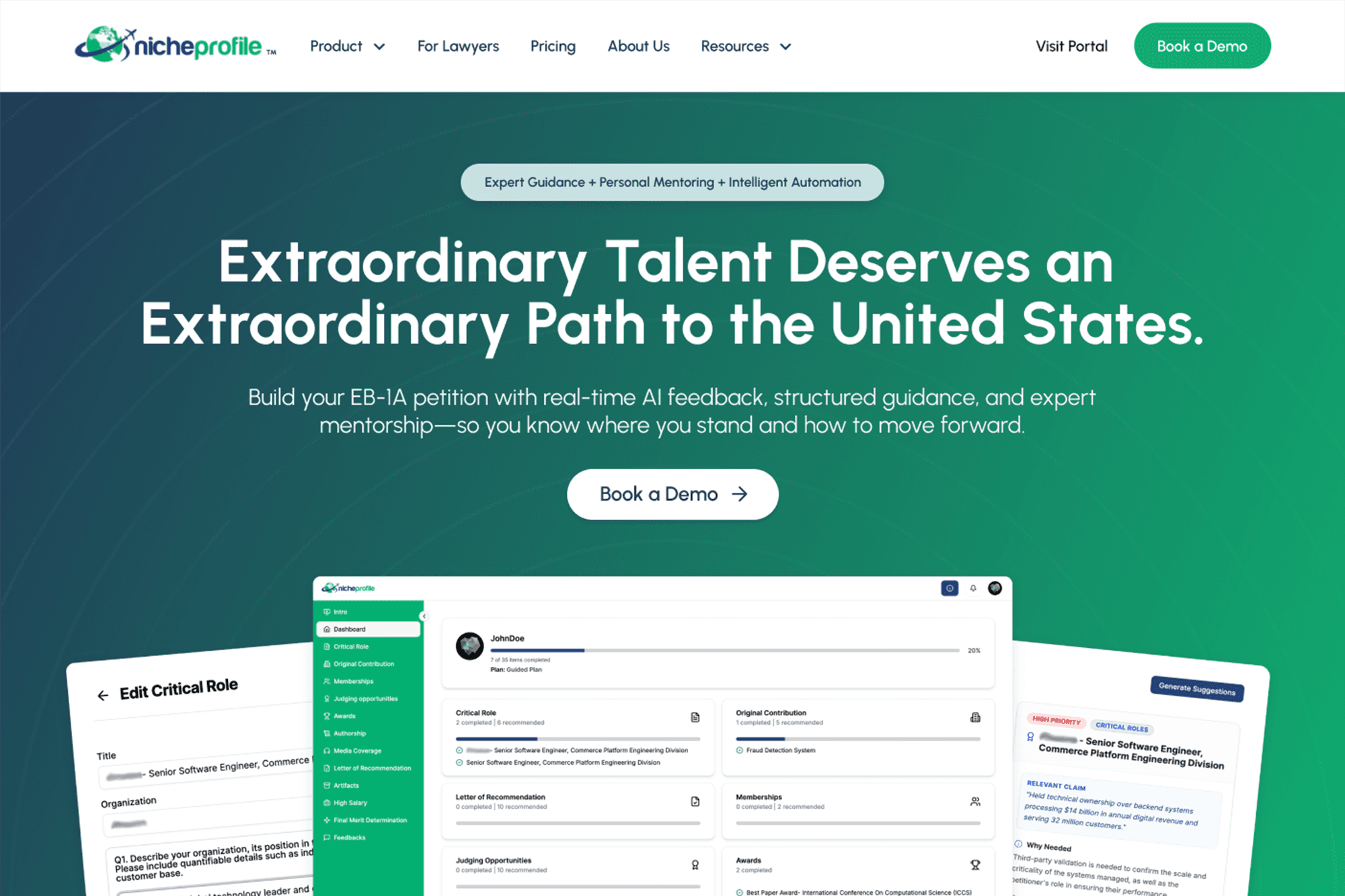
Website Redesign & Prototyping
High-Fidelity Prototyping for Immigration Platform
Full website redesign and developer handoff for an EB-1A immigration advisory platform, NicheProfile, including a three-tier e-commerce flow, portal onboarding graphics, and component library.
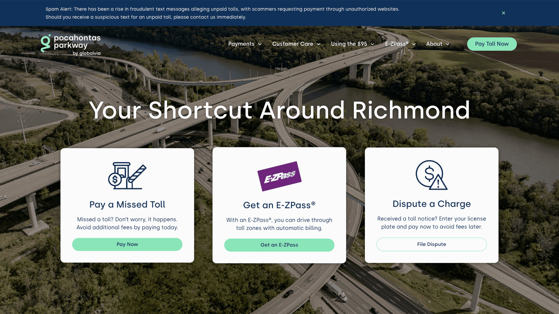
Website UX/UI Design & Development
Website Design & Development for Major Toll Roadway
Full redesign of a public toll authority, Pocahontas Parkway 895, website. Centered around restructuring payments, managing toll disputes, and promoting E-ZPass.