Website UX/UI Design & Development
Website Design & Development for Major Toll Roadway
Pocahontas Parkway 895 · pocahontas895.com
Results at a glance
Total clicks (reporting period)
- Result
- 10,700
Total impressions
- Result
- 49,600
Organic traffic growth
- Result
- +1,300 visitors
Organic keyword sessions
- Result
- 213 (+45)
#1 keyword rankings
- Result
- 6 high-intent terms
Domain Rating
- Result
- 37 (+6)
FAQ avg. engagement time
- Result
- 1:59
Dispute page avg. engagement time
- Result
- 4:56
US traffic share
- Result
- 95.4%
| Metric | Result |
|---|---|
| Total clicks (reporting period) | 10,700 |
| Total impressions | 49,600 |
| Organic traffic growth | +1,300 visitors |
| Organic keyword sessions | 213 (+45) |
| #1 keyword rankings | 6 high-intent terms |
| Domain Rating | 37 (+6) |
| FAQ avg. engagement time | 1:59 |
| Dispute page avg. engagement time | 4:56 |
| US traffic share | 95.4% |
The Challenge
Pocahontas Parkway 895 serves thousands of Richmond-area drivers who arrive on the website each with one thing in mind: pay a toll, dispute a charge, figure out E-ZPass, and they need to do it fast. Any and all friction translates directly into confused drivers clogging toll booth lines and flooding the on-site support team with calls about things the website should have already answered.
The old site had three core problems:
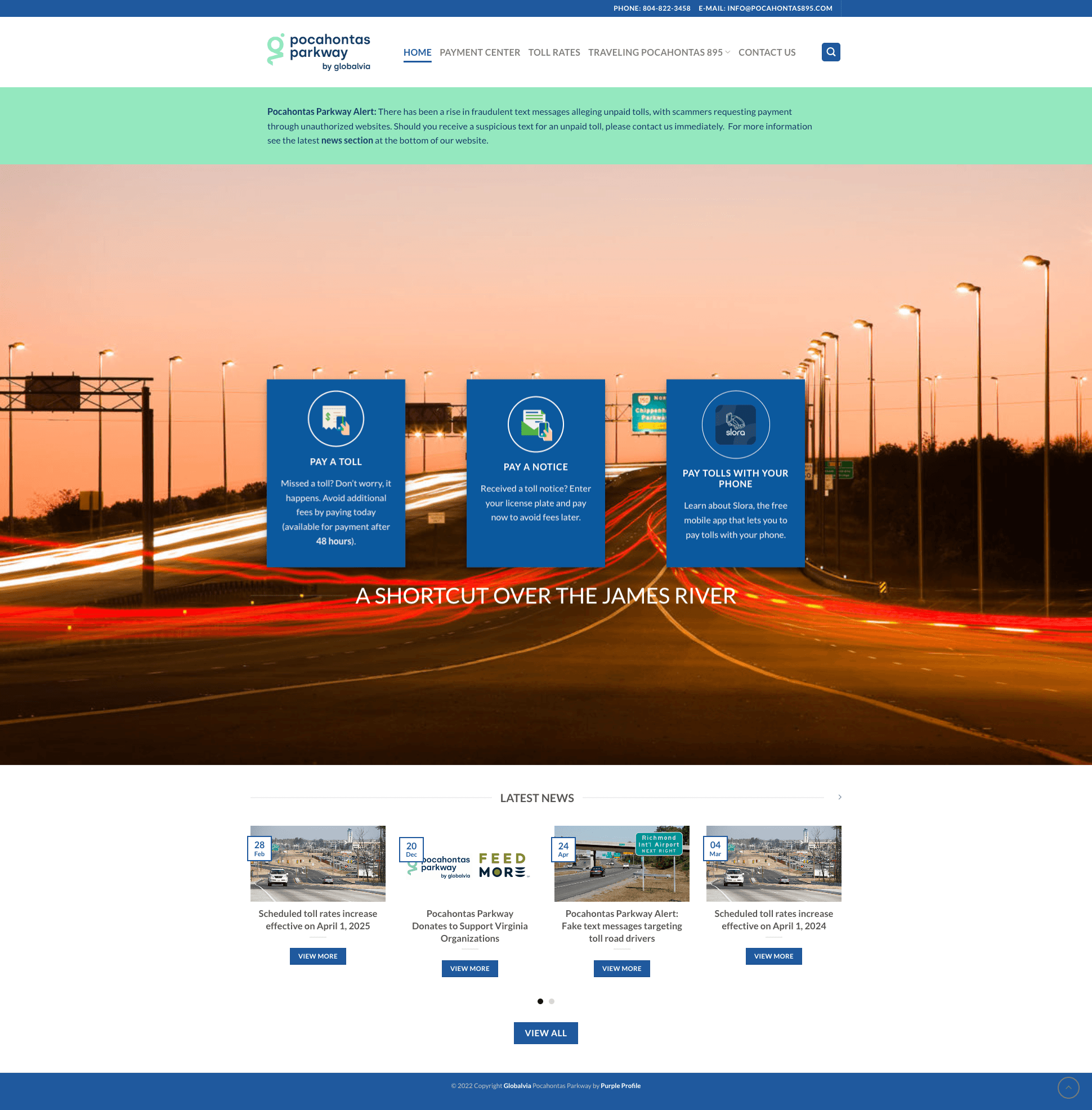
- A confused payment experience. Drivers were presented with two separate paths: “Pay a Notice” and “Missed a Toll,” when most users just knew they owed money for passing through the tollbooths and had no idea which category applied to them. The distinction that made sense internally created real confusion externally.
- Content that reads like internal documentation. The FAQ page was a wall of accordion items across six categories, with dozens of questions, no hierarchy, no visual relief, and no way to quickly scan for user-centric, relevant topics. The Payment Center page buried critical instructions in dense paragraph copy beneath a large hero image.
- Visual identity conflict. The E-ZPass page was dominated by E-ZPass's own purple branding, overriding Pocahontas Parkway's identity and making it feel like a different website entirely. For a public utility, brand trust matters.
The goal: Transform the website from a digital brochure into a functional self-service platform that reduces inbound support volume and improves toll payment efficiency.
Accessibility constraints: As a public-facing utility serving a broad regional population, the redesign required ADA compliance (WCAG 2.1 and 2.2 Level AA standards), readability for low-digital-confidence users, and a mobile-first approach, since the majority of drivers searching for toll information do so on their phones, often while still in their cars.
Process
1. Discovery: client input + analytics audit
Working with the Pocahontas Parkway operations team, I identified the three highest-priority driver tasks through a combination of client feedback from toll booth staff, analytics review, and quality audit of the existing site. Tolling staff reported that the most common inbound calls were about payment confusion, dispute status, and E-ZPass enrollment, all things the old site technically addressed, but buried poorly.
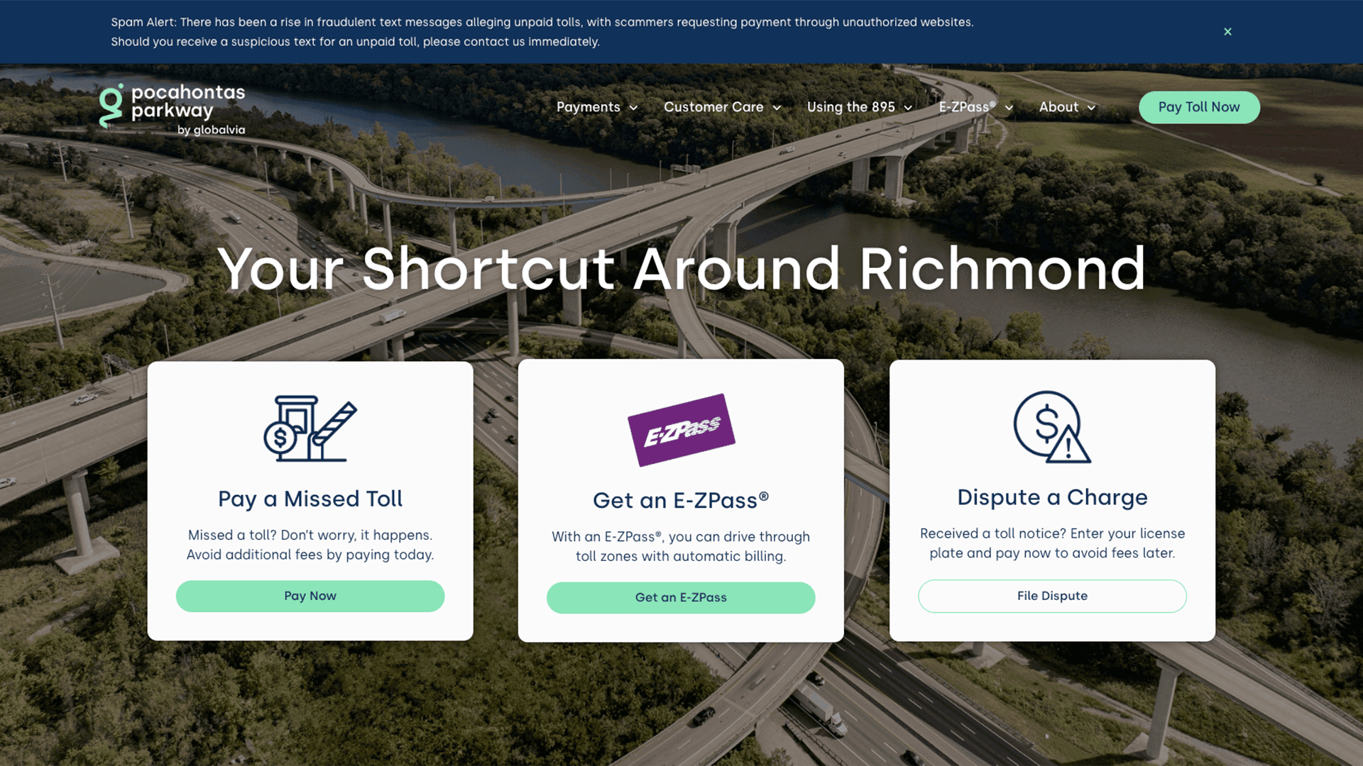
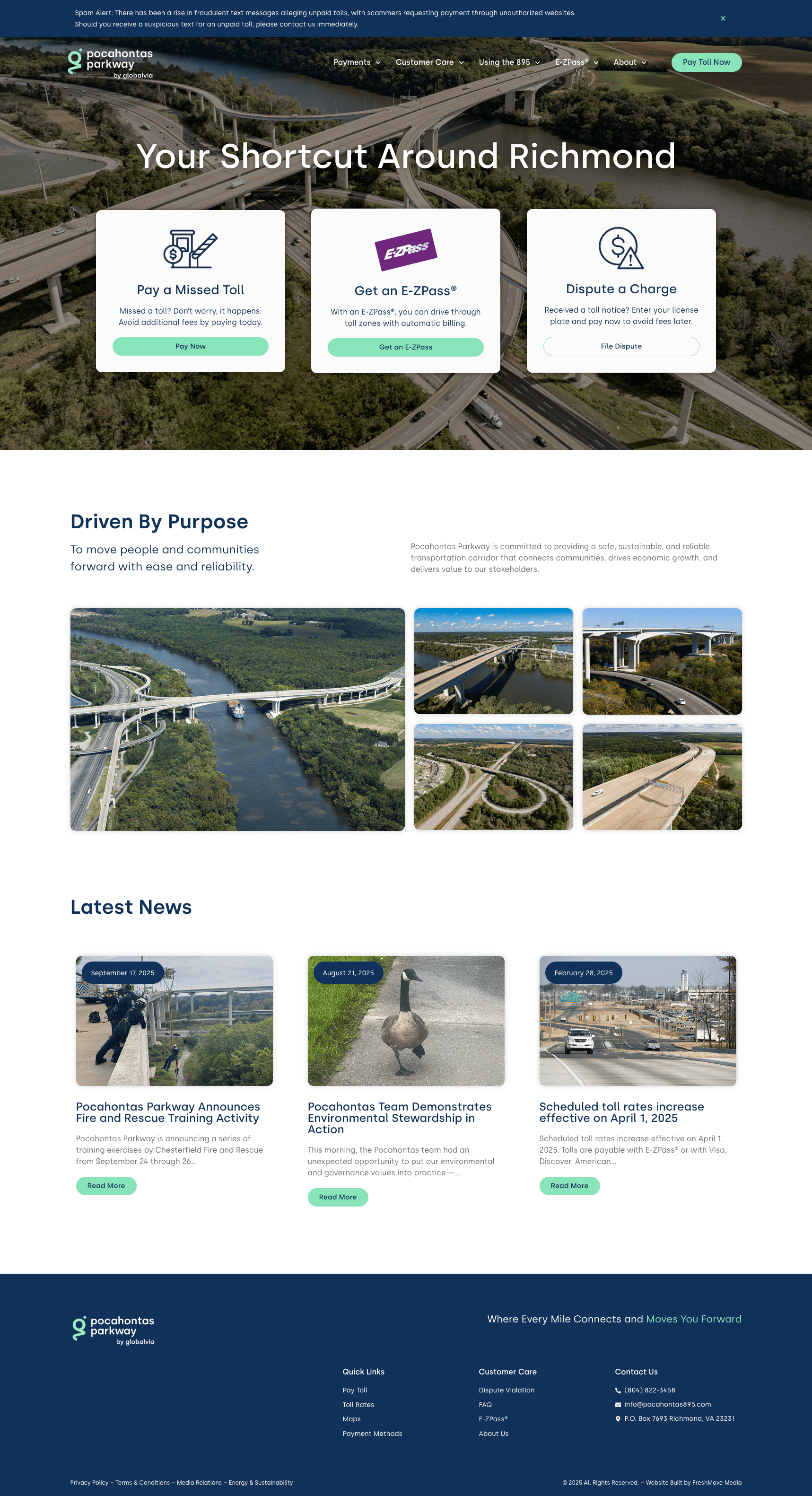
This informed the primary IA decision: the homepage would lead with three explicit, scannable tasks: Pay a Missed Toll, Get an E-ZPass, and Dispute a Charge with clear CTAs above the fold.
2. Restructuring the information architecture
The old navigation grouped content into broad categories (“Traveling Pocahontas 895,” “Payment Center”) that required users to know the site's internal logic to find what they needed. I restructured the nav around driver intent:
- Payments → Make a Payment / Payment Methods
- Customer Care → Dispute a Violation / FAQ / Contact Us
- Using the 895 → Maps / Toll Rates
- E-ZPass → Learn About E-ZPass / Purchase an E-ZPass
Every label is a task or a known product name, instead of a department name or internal terminology.
3. Solving the payment confusion
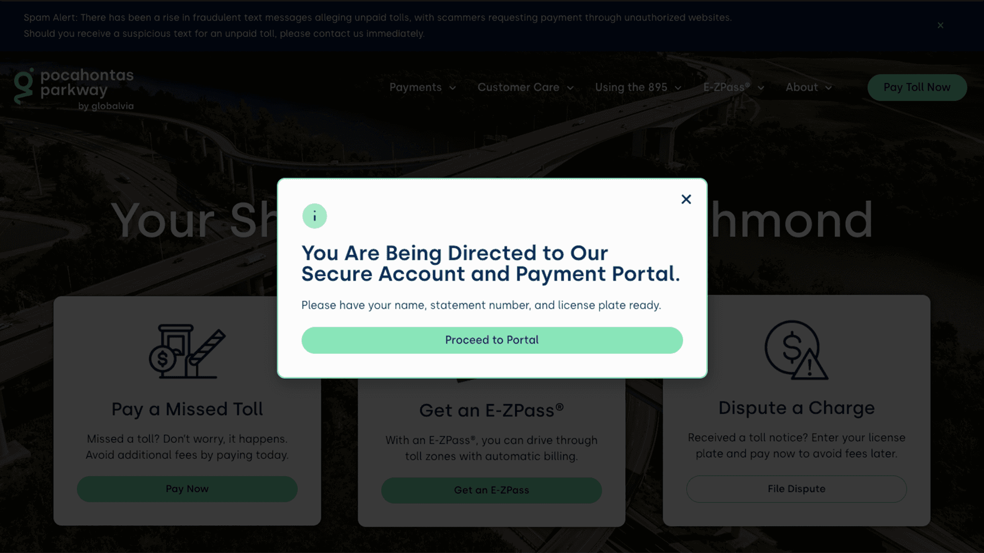
The “Pay a Notice vs. Missed a Toll” distinction was eliminated from the user-facing experience. The homepage CTA reads simply: Pay a Missed Toll. The payment flow then handles routing behind the scenes on an external platform, along with a notice for users to acknowledge and accept being sent to another URL. Users no longer need to self-diagnose their situation before starting the process.
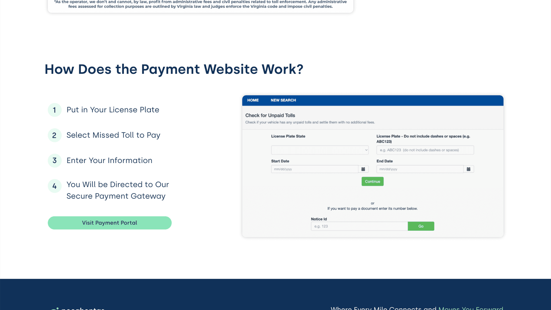
4. Redesigning the dispute experience as a self-service funnel
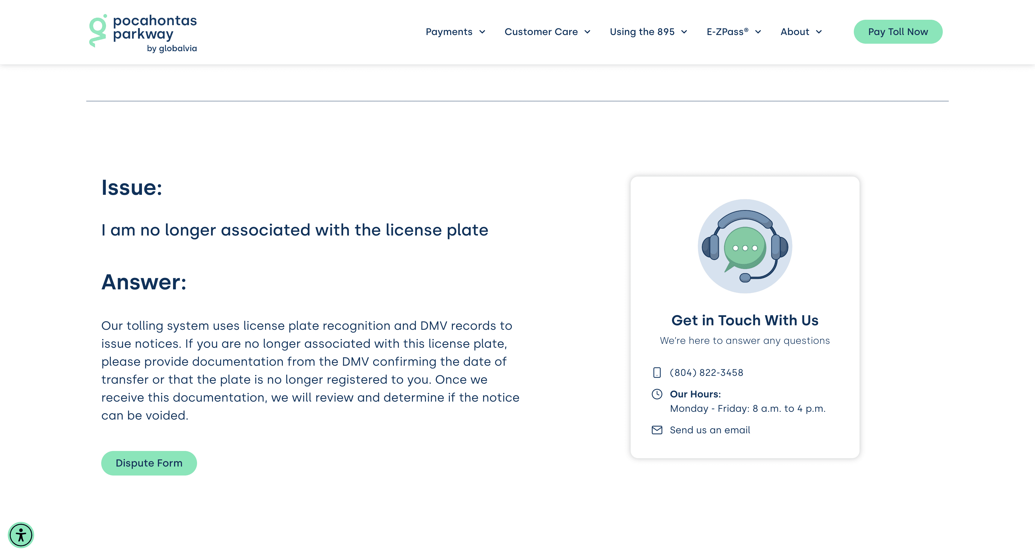
The dispute page became one of the most carefully considered UX decisions in the project. Rather than a simple form or a contact prompt, I structured it as a guided Q&A flow:
- Users answer questions about their situation
- The flow routes them to a specific course of action with clear next steps
- If their issue can't be resolved through self-service, they are escalated to a dedicated contact form for the 895 team
The goal was to reduce repeated inbound questions to toll booth staff so they could focus on complex or specialized disputes. The result: an average engagement time of 4:56 on that page, nearly 5 minutes of active, task-focused use with a bounce rate of 12%.
5. Rebuilding the FAQ + map database for scannability
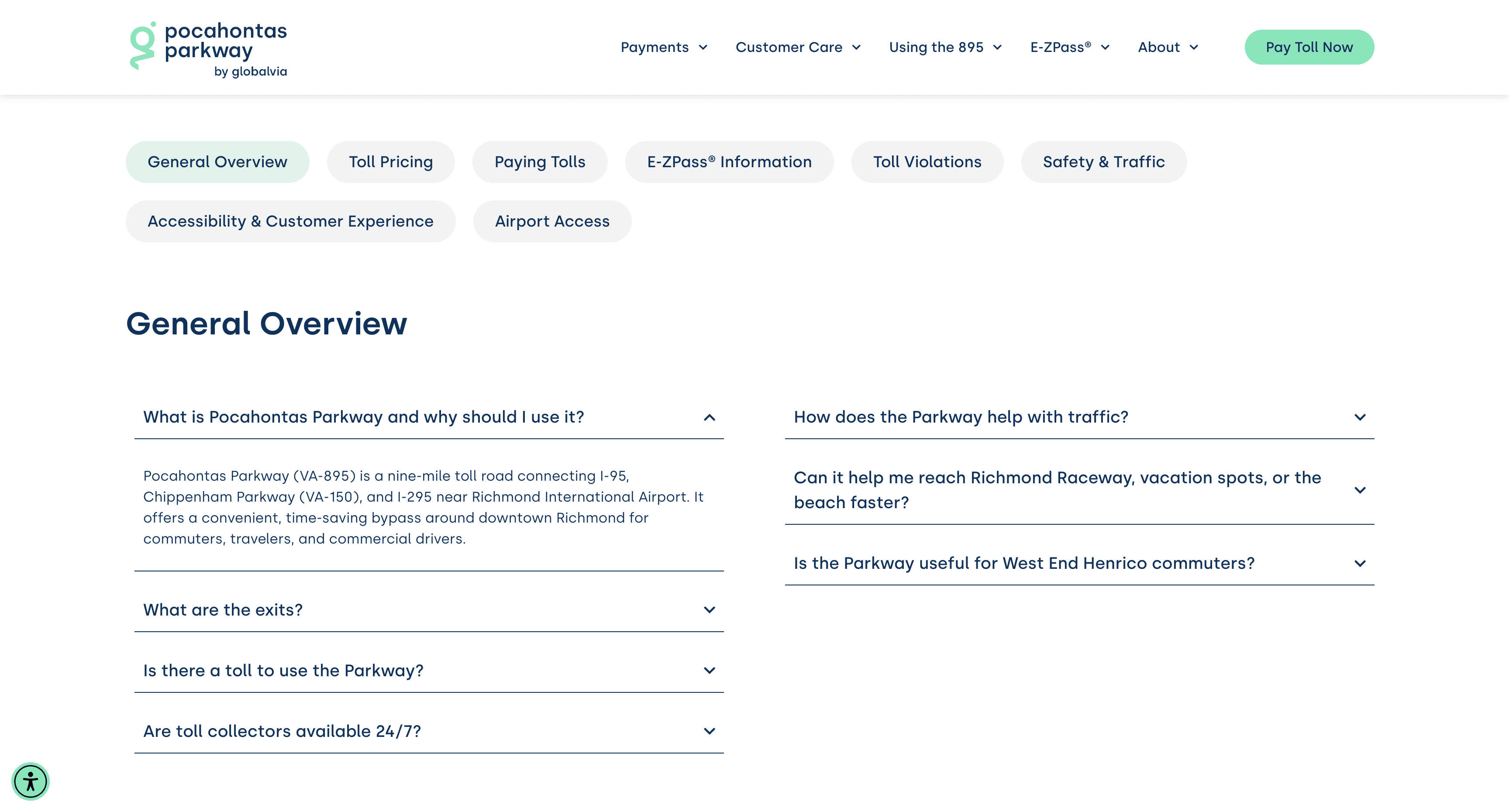
The old FAQ was a documentation dump. I restructured it with clear section headings, reduced the number of visible accordion items per section, and ensured the most commonly searched questions appeared first. The restructured page showed an average engagement time of 1:59, indicating that users are finding answers.
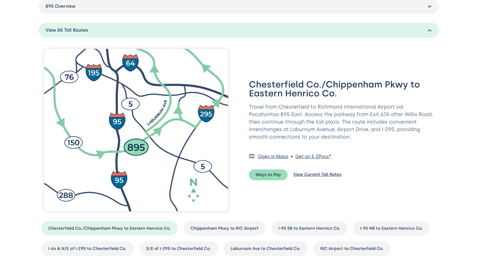
For maps, convoluted, detailed graphics overwhelmed and confused toll drivers more than they assisted with the flow of daily traffic. As Pocahontas Parkway wanted to define itself with its slogan: “Your Shortcut Around Richmond”, we aimed to recreate simple, informative maps with quick overviews and links to unique routes via Google Maps.
6. Establishing brand ownership over E-ZPass content
The old E-ZPass page led with E-ZPass's own branding: purple headers and their logo dominating the hero. I redesigned the page to present E-ZPass as a tool that the Parkway offers, integrated within Pocahontas Parkway's visual identity. This strengthened brand trust and eliminated visual inconsistency through playful illustration elements.
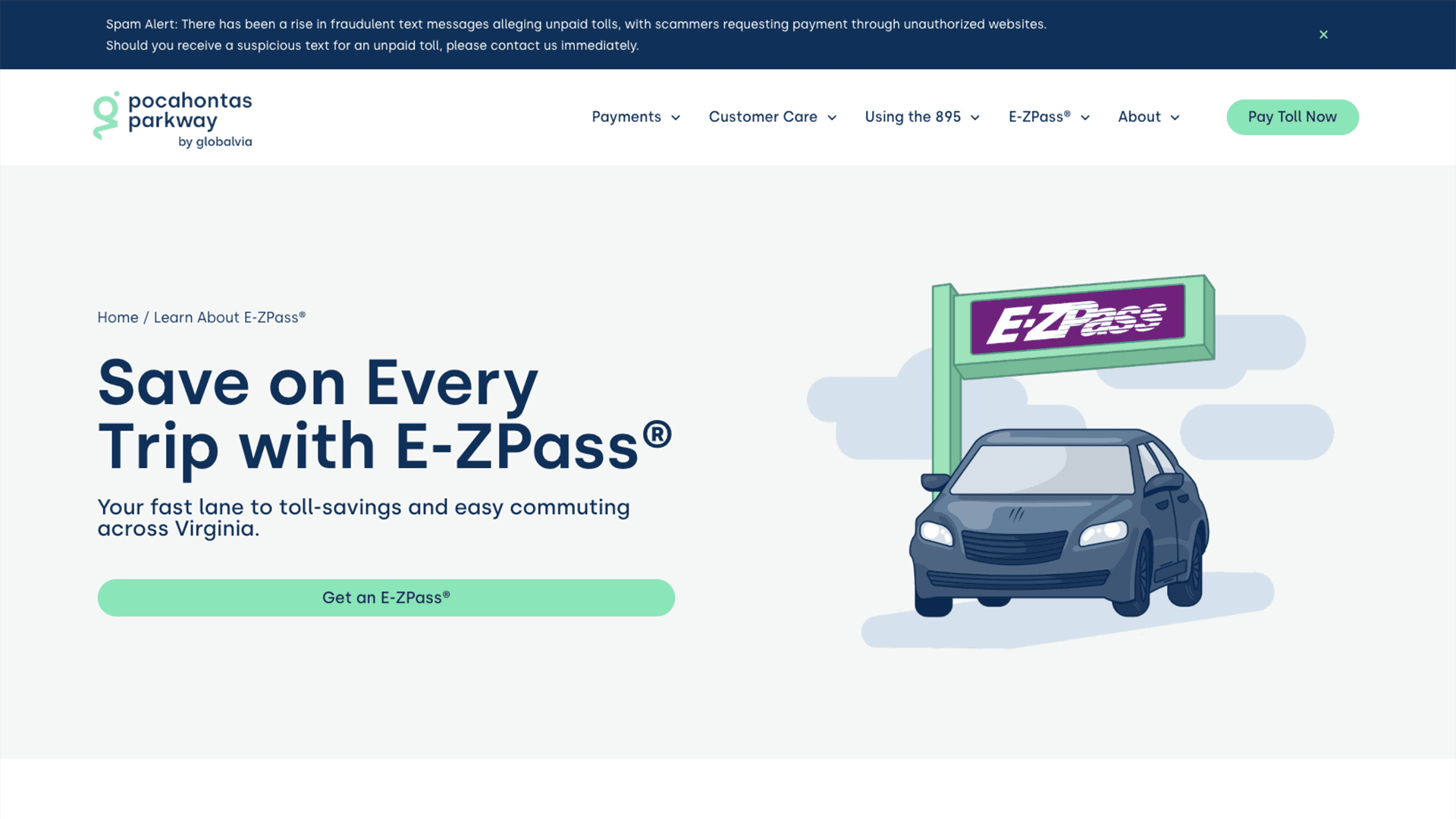
7. SEO infrastructure built into the IA
Keyword research informed both content structure and page naming, while maintaining the structural integrity of the previous sitemap. Pages were optimized for high-intent transactional queries, and the real terms drivers actually search for when they owe a toll. Structured data, sitemap coverage, and crawlability were addressed from the build stage and tested post-launch.
An ongoing Website Quality Audit (WQA) system continuously monitors indexation, schema implementation, keyword rankings, and technical action items. Every 3-6 months, the audit is rerun to identify areas for improvement and gaps in visibility.
Design-to-Build Workflow
Outcomes
Lighthouse Scores
Performance
- Before Redesign
- 63/100 (Fair)
- After Redesign
- 98/100 (Excellent)
- Change
- ↑ 35pts
Accessibility
- Before Redesign
- 86/100 (Good)
- After Redesign
- 92/100 (Excellent, Supplemental Support from Userway Widget)
- Change
- ↑ 6pts
Best Practices
- Before Redesign
- 73/100 (Fair)
- After Redesign
- 100/100 (Excellent)
- Change
- ↑ 27pts
SEO
- Before Redesign
- 92/100 (Excellent)
- After Redesign
- 98/100 (Excellent)
- Change
- ↑ 6pts
| Metric | Before Redesign | After Redesign | Change |
|---|---|---|---|
| Performance | 63/100 (Fair) | 98/100 (Excellent) | ↑ 35pts |
| Accessibility | 86/100 (Good) | 92/100 (Excellent, Supplemental Support from Userway Widget) | ↑ 6pts |
| Best Practices | 73/100 (Fair) | 100/100 (Excellent) | ↑ 27pts |
| SEO | 92/100 (Excellent) | 98/100 (Excellent) | ↑ 6pts |
Search Visibility
The site now ranks #1 for six critical high-intent search terms:
- “895 toll”
- “pocahontas parkway”
- “895 toll cost”
- “pocahontas parkway 895”
- “pocahontas parkway toll violation”
- “pocahontas895”
“895 toll cost” saw +530% increase in clicks, while “895 toll richmond” grew +360%. We identified these queries with the most search volume in the pre-build strategy, and they continue to grow.
Traffic Quality
95.4% of all organic traffic came from the United States, specifically the Richmond metro market. Identifying that the website is reaching its target audience and serving the best pages organically.
Engagement Where It Counts
The operational pages (directly serving paying drivers) show strong engagement:
/file-a-dispute
- Avg. Engagement Time
- 4:56
/learn-about-e-zpass
- Avg. Engagement Time
- 2:11
/maps
- Avg. Engagement Time
- 2:05
/frequently-asked-questions
- Avg. Engagement Time
- 1:59
| Page | Avg. Engagement Time |
|---|---|
| /file-a-dispute | 4:56 |
| /learn-about-e-zpass | 2:11 |
| /maps | 2:05 |
| /frequently-asked-questions | 1:59 |
For comparison, a casual blog post on the same site averages 0:10 and has a 90% bounce rate. The redesigned operational pages are performing as intended, with continuous monitoring, testing, and improvement.
Operational Impact
Increasing self-service resolution on the dispute page directly reduces inbound volume for toll booth staff, freeing them to handle more complex hands-on cases. This was a stated business goal at the outset, and the engagement data supports that it's working.
Reflection
This project reinforced an important point: good UX for a utility is almost invisible. When it works, drivers find what they need, complete their task or payment, and move on with little friction.
What I'd do differently: I'd push earlier for a deeper analytics handoff from the old site before building the new IA. We worked from staff feedback and top-level page data, but HotJar heatmaps or session recordings from the previous site would have added another layer to the internal structural decisions.
Related Work
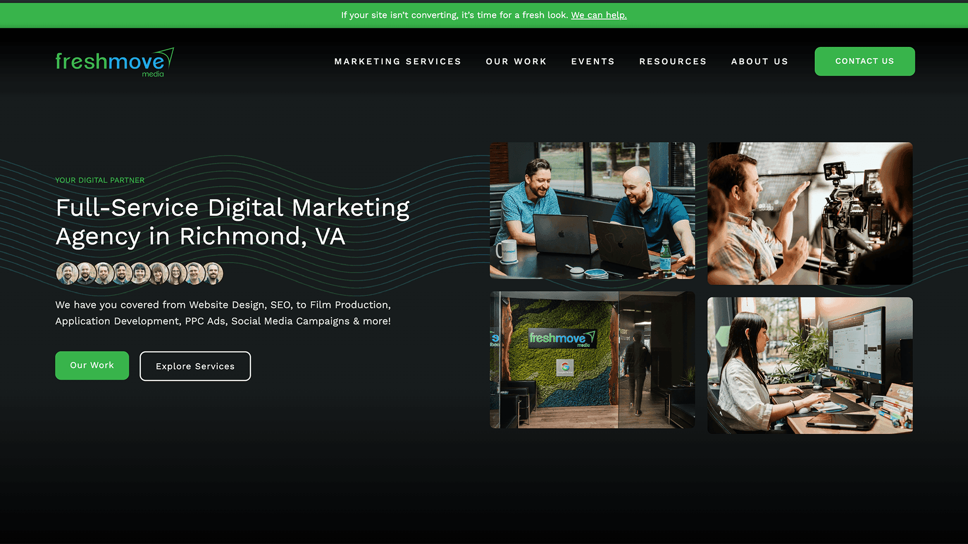
UX/UI Strategy & Development
Agency Website Design, Development, & UI System Build
Leading the redesign of a website design agency's own website, a scalable UI system, restructured IA, and a content engine built for organic growth.
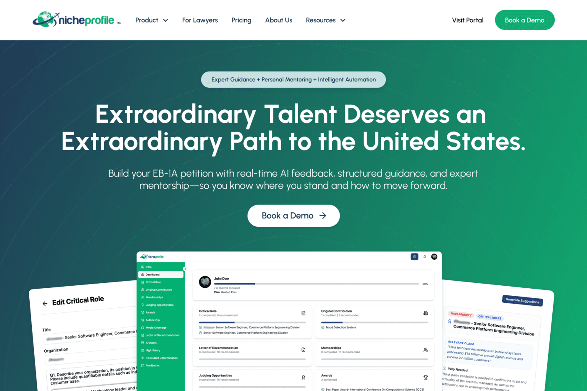
Website Redesign & Prototyping
High-Fidelity Prototyping for Immigration Platform
Full website redesign and developer handoff for an EB-1A immigration advisory platform, NicheProfile, including a three-tier e-commerce flow, portal onboarding graphics, and component library.