Product Design & Development
Website Quality Audit Web App
FreshMove Media · wqa.freshmovemedia.com
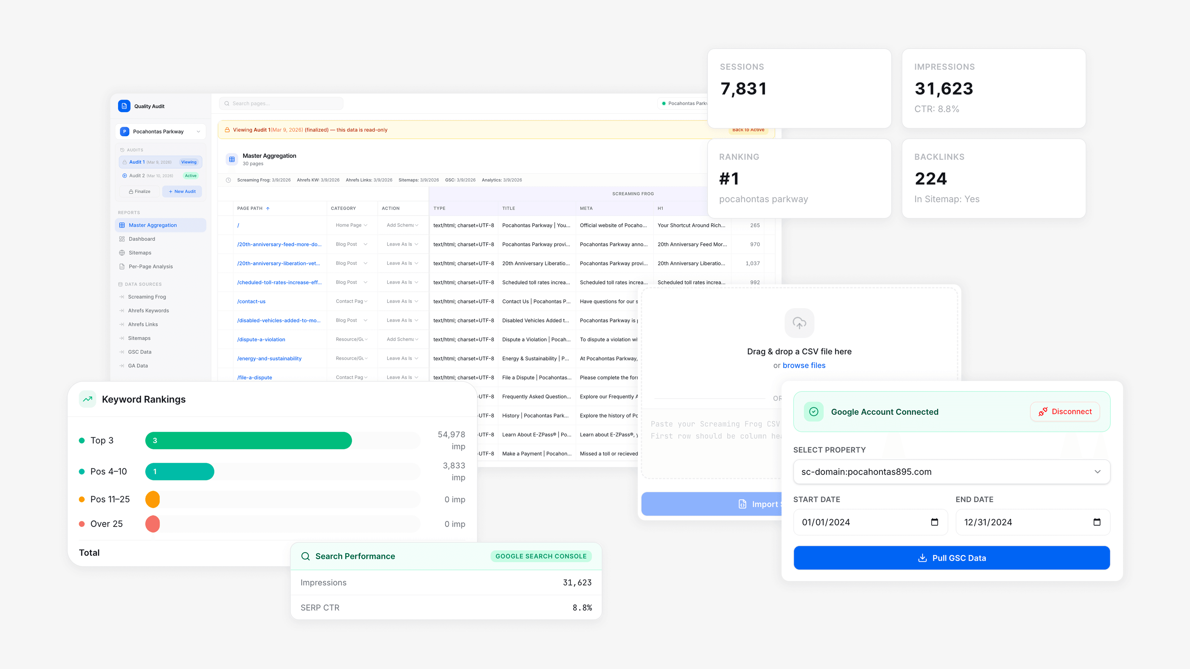
Impact at a glance
External cost eliminated
- Result
- $200/month
Audit time per client (before)
- Result
- ~1.5 hours
Audit time per client (after)
- Result
- ~30–45 minutes
Time saved per audit
- Result
- ~50–60%
Deliverable
- Result
- Replaced Google Sheet + explanatory slide deck with self-serve dashboard
| Metric | Result |
|---|---|
| External cost eliminated | $200/month |
| Audit time per client (before) | ~1.5 hours |
| Audit time per client (after) | ~30–45 minutes |
| Time saved per audit | ~50–60% |
| Deliverable | Replaced Google Sheet + explanatory slide deck with self-serve dashboard |
The Problem
Every SEO client at FreshMove Media receives a Website Quality Audit (WQA): a comprehensive review of their site's technical health, keyword rankings, indexation status, content gaps, and traffic performance. It's one of our agency's most substantive deliverables, pulling data from four separate sources: Screaming Frog, Ahrefs Keywords and Backlinks, Google Search Console, and Google Analytics.
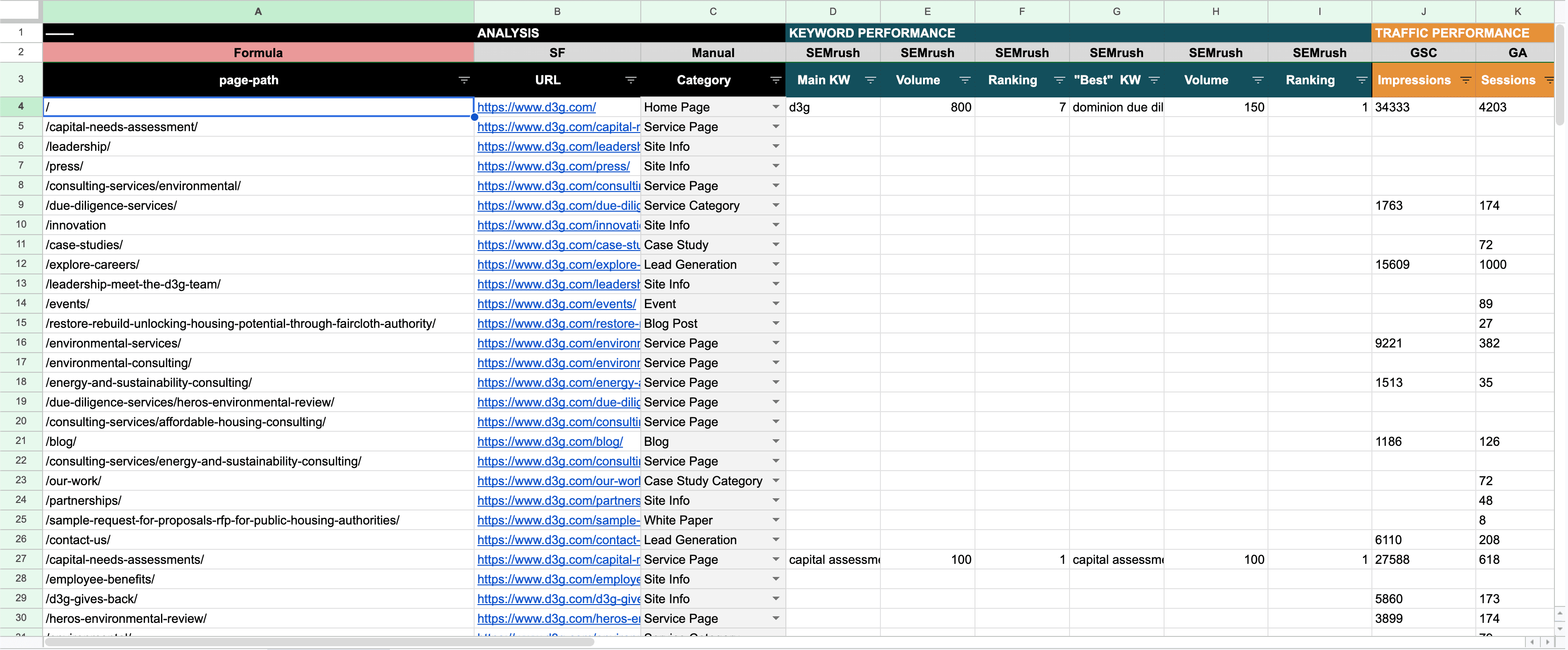
The tool our agency used to produce these audits was a Google Sheets template purchased from an external vendor for $200/month.
The spreadsheet had three compounding problems:
- It was unreliable: Formula errors were common — including a #VALUE! error visible directly in the dashboard, breaking a core part of the summary view for client-facing audits. Data imports were inconsistent, and the tool crashed with larger datasets and complex imports.
- It was slow: Manually pulling, formatting, and cross-referencing data from four sources into a rigid spreadsheet structure took approximately 1.5 hours per client audit, time that should have been spent on analysis and strategy, not data wrangling.
- It wasn't a client experience: When the audit was complete, the Google Sheet was too raw and too dense to hand directly to a client. Bounce rates were unformatted, data was crammed horizontally, and columns lacked visual hierarchy. A separate internal slide deck had to be built for each client's unique data to explain how to read the spreadsheet and outline our proposed technical and content actions. The audit and the client presentation were two separate pieces of work.
The Opportunity
We tackled the spreadsheet's failures as a product design problem, and decided our agency needed something that could:
- Reliably ingest and sync data from multiple sources without manual intervention
- Surface actionable insights rather than handing off raw data
- Be handed directly to clients as a finished deliverable, not a starting point for a slide deck
- Track audit history so clients could compare performance across reporting periods
- Allow FMM staff to assign and manage technical and content action items per page, tied to each client's SEO package tier
Process
1. Defining Requirements
I worked directly with our COO to map the full workflow: which data sources were needed, what the internal team actually needed to see vs. what clients needed to see, and where the Google Sheet created the most friction. We defined our key insight as the internal and client views had different jobs. The internal view needed to support action-taking and task management, while the client's view needed to support comprehension and confidence.
2. Designing the UI
Rather than designing from scratch, I built the WQA interface using FreshMove Media's existing UI kit that I had previously designed for our agency website redesign, ensuring visual consistency with our branding and accelerating the design phase. The dashboard was designed around four core views:
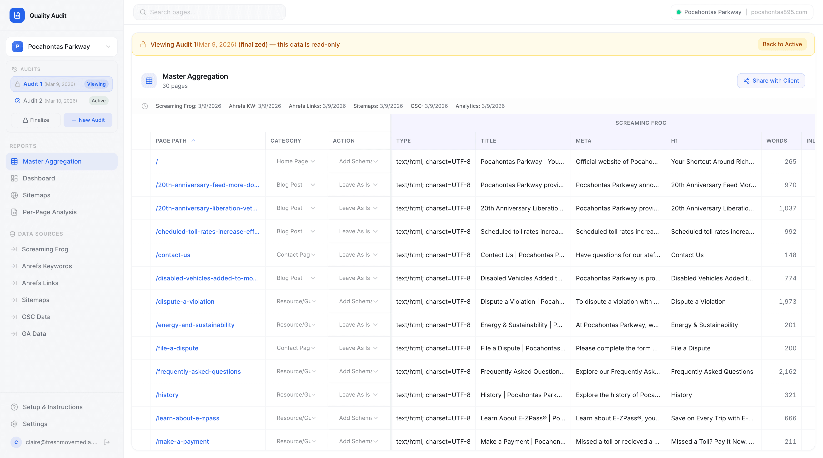
Master Aggregation: A filterable, sortable table of every page on the client's site, pulling from all five data sources simultaneously. Page path, category, assigned action, Screaming Frog technical data, title/meta/H1 status, and keyword data are visible in a single unified row per page. MISSING tags flag content gaps in red, making them immediately actionable without a required formula.
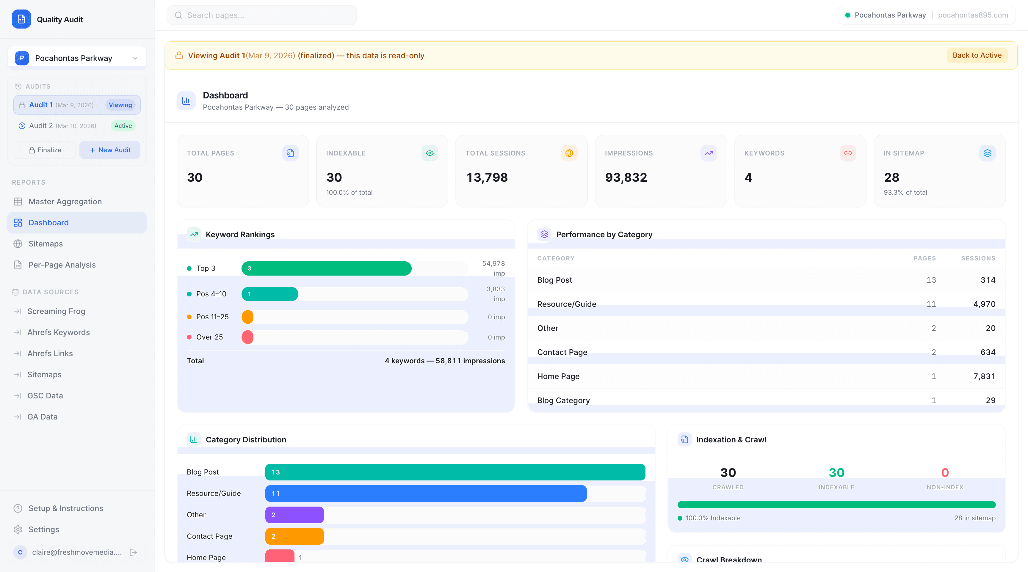
Dashboard: A summary view showing total pages, indexable pages, total sessions, impressions, keyword count, and sitemap coverage. Keyword rankings visualized as a horizontal bar chart (Top 3 pages / Positions #4-10 / Positions #11-25 / Over 25). Performance by category, breaking down sessions across Blog Posts, Landing Pages, Portfolio Pages, Service Pages, and more.
Sitemaps: Sitemap health, structure, and coverage at a glance.
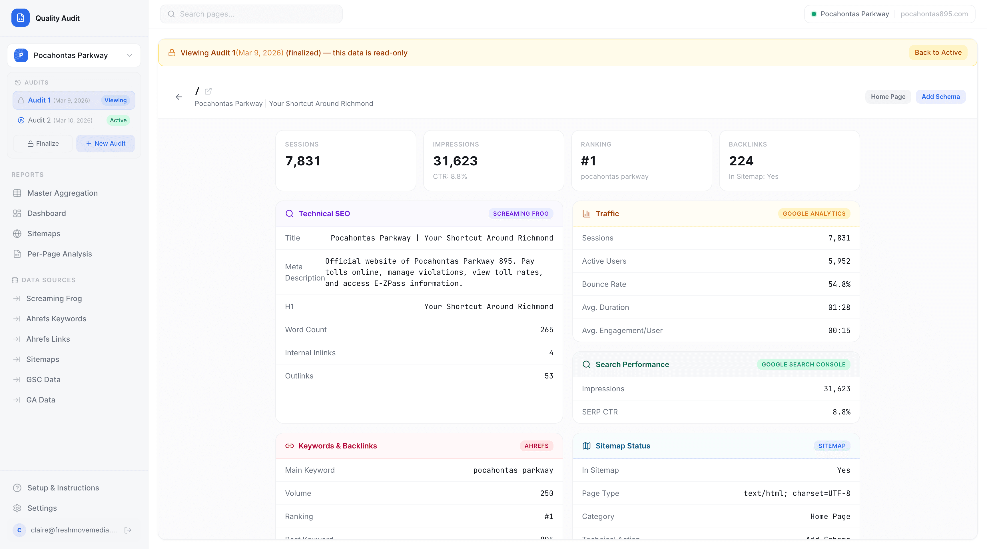
Per-Page Analysis: Individual page cards showing sessions, keyword rank, and active users. Clicking into any page details full technical data (title, meta, H1, word count, internal/outlinks), traffic data from GA (sessions, active users, bounce rate, avg. duration), search performance from GSC (impressions, SERP CTR), and sitemap status, all pulling live from connected data sources.

3. Client-Facing View
A core product decision was building a shareable read-only client login as a separate access layer that gives SEO clients direct visibility into their own audit data without requiring internal FMM staff to build a presentation. Clients can:
- Review their current audit and all past finalized audits
- Monitor pages losing traffic, high-converting pages, and keyword ranking movements
- Track technical and content implementations over time, scoped into their SEO package
- Track impressions, sessions, search positioning, and bounce rate over time
With the elimination of the shared slide deck ‘key’, the dashboard became the deliverable.
4. Audit Workflow + Data Source Connections
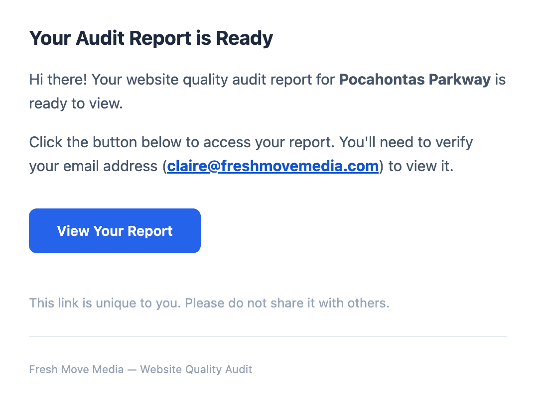
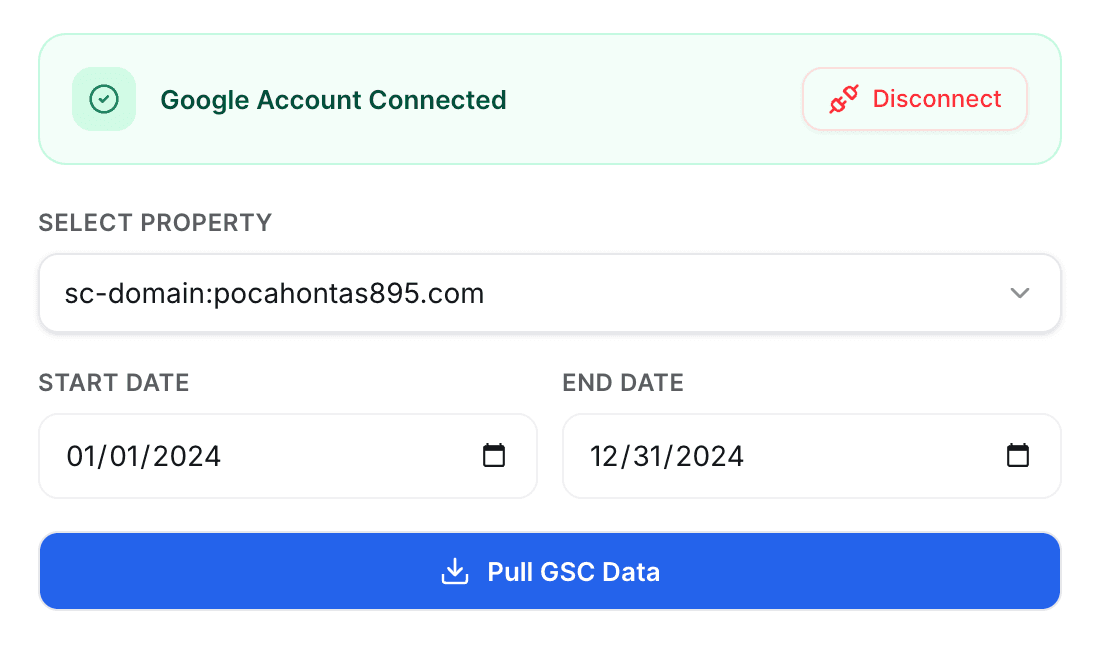
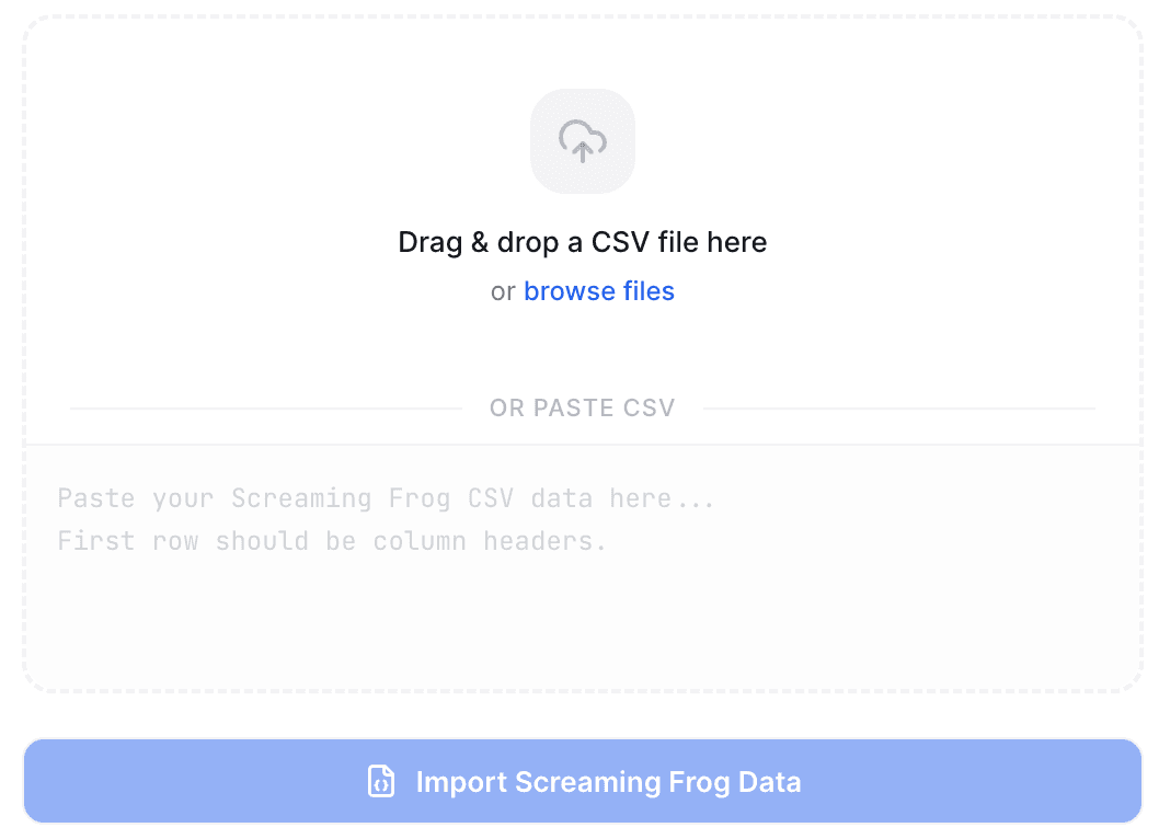
The tool connects directly to each client's GSC and GA accounts, and imports additional data from Screaming Frog and Ahrefs. Audits are versioned, typically by quarter, and internal staff can create a new audit, work in it, finalize it (locking it as read-only), and the client retains access to all historical audit snapshots. This control lets staff return to a live audit without losing the finalized record.
Tools Used
Outcomes
Operational: The most immediate internal impact was time. Audit production dropped from approximately 1.5 hours to 30-45 minutes per client, a reduction of roughly 50–60%. The recovered time is now redirected toward thoughtful content and technical tagging, goal-setting for website improvement, and strategic analysis to drive client results.
The $200/month vendor subscription was eliminated entirely on day one of the WQA's launch.
Client Experience: Clients receiving access to their custom WQA dashboard have responded positively to having a self-serve view of their own data that they can return to between reporting calls without needing to interpret a dense spreadsheet or wait for an FMM team member to walk them through a slide deck. The shift from “here's a file we'll explain” to “here's your dashboard, log in anytime” is a positive change in our relationship with SEO clients.
Product:The WQA is now a tangible differentiator in our agency's SEO service offering, included in mid-tier and above packages as a client-facing deliverable.
Reflection
This project was different from every client engagement I've worked on because the users were people I sat next to every day. I knew exactly what was frustrating them, and I could test with the workflow in real time and iterate based on direct feedback from the people using it the next morning. That proximity to the problem made the design process and internal decision-making faster.
The most important product decision was treating the client view and the internal view as two distinct products with different jobs, even though they share the same underlying data. That distinction is what allowed the dashboard to replace the slide deck rather than just replace the spreadsheet alone.
What I'd do differently: Earlier investment in defining the data schema and source-connection architecture before designing the UI would have prevented some mid-build restructuring when edge cases in data imports surfaced. For a product pulling from four live, updating data sources, the data model is the design foundation, and should have been locked before the interface.
Related Work
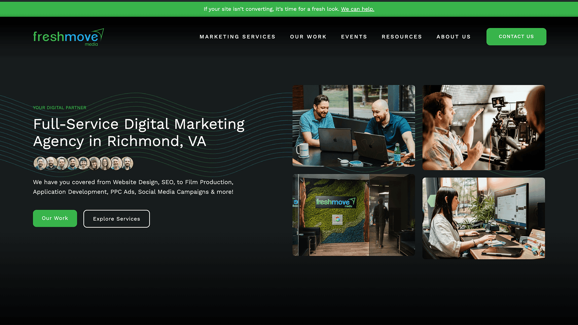
UX/UI Strategy & Development
Agency Website Design, Development, & UI System Build
Leading the redesign of a website design agency's own website, a scalable UI system, restructured IA, and a content engine built for organic growth.
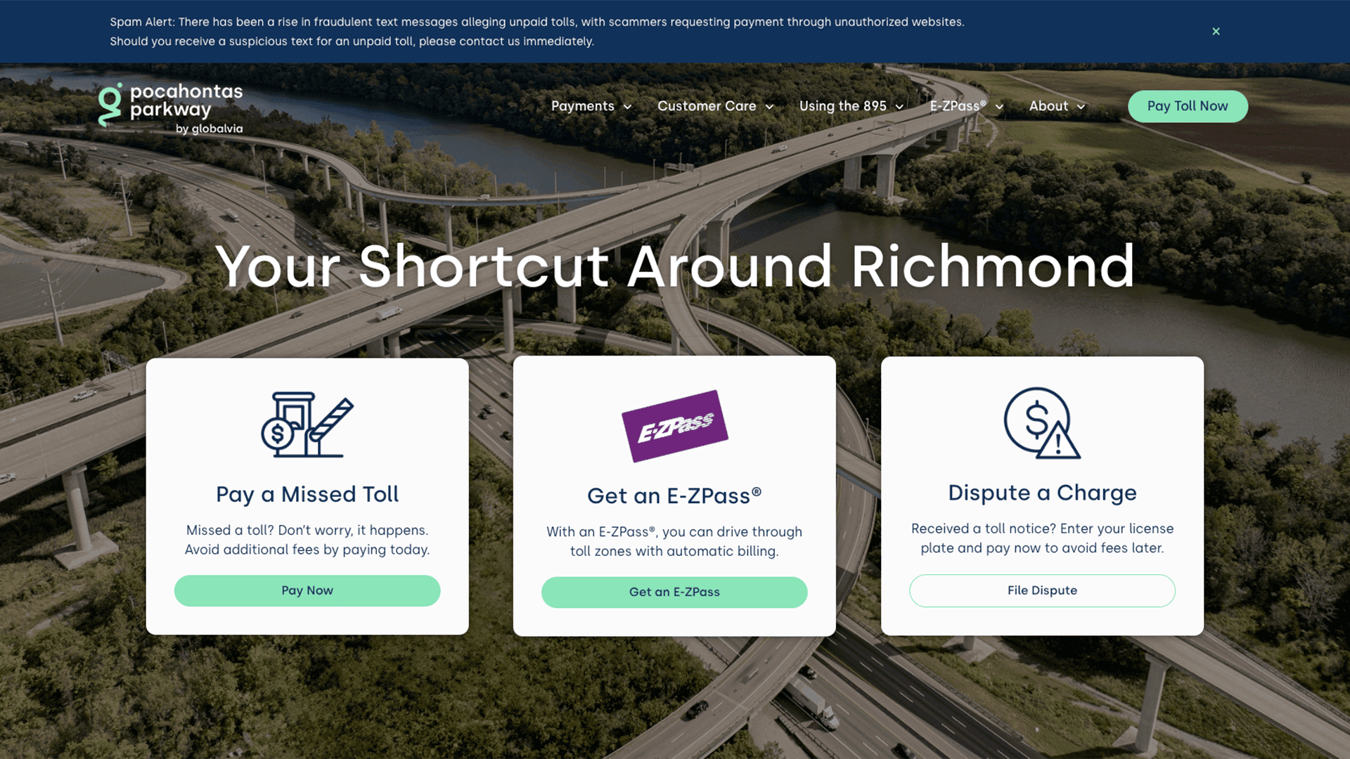
Website UX/UI Design & Development
Website Design & Development for Major Toll Roadway
Full redesign of a public toll authority, Pocahontas Parkway 895, website. Centered around restructuring payments, managing toll disputes, and promoting E-ZPass.